Picking a color for your bathroom vanity isn't just about following trends; it's about making choices that work for you and your space. Think about how a bold, moody shade can make a statement or how a neutral, timeless color might just be what your bathroom needs to breathe. Consider how light reflects in the room; natural light versus artificial can change the game when you're talking about tones.
Another thing you can't overlook? How big or small your bathroom is. A dark, rich hue might feel snug and cozy in a larger space, yet crowded in a smaller one. And who says you have to stay traditional? Today's trends are all about self-expression. So, why not explore colors off the beaten path and see how they add personality?
- Understanding the Impact of Color
- Timeless Neutrals and Their Appeal
- Bold Choices and Modern Trends
- Tailoring Your Vanity to Fit Your Space
Understanding the Impact of Color
When you step into a bathroom, the color of the vanity can either whisper calm or shout boldness. The color sets the mood. Are you hoping for a relaxing spa-like atmosphere? Light blues or soft greens can work wonders. Or maybe you want your space to be energetic and lively? In that case, consider vibrant yellows or deep teals.
Color in a bathroom also affects perception. Light colors can make a small bathroom feel larger, while dark hues can add depth and a sense of luxury, especially if you're dealing with lots of bathroom remodeling elements. Designer Ashley Stark Kenner once shared,
"A simple change in color can utterly transform the mood of a space. It's one of the easiest, yet most impactful design decisions."
The way color interacts with light is crucial too. Natural sunlight tends to be more forgiving, allowing for diverse color choices. But in a bathroom with limited light, you might want to stick to brighter colors to avoid the space feeling closed in.
Let's not forget personality! The right color should reflect who you are. A daring personality might lean towards unexpected colors like burnt orange or navy, adding a dose of confidence. So, while picking a color, think about what feels right for you, not just what’s trending now. After all, your bathroom should be your retreat.
Timeless Neutrals and Their Appeal
Think about it: neutral vanities aren't just about playing it safe. They're the unsung heroes in bathroom design, offering a backdrop that suits different styles and personal touches. Whites, grays, and beiges stand out because they blend in with just about anything while offering a clean and open look.
Whites, for instance, are like the little black dress of vanities. They never go out of style and instantly give a fresh, clean vibe. Plus, they're a good match with almost any wall or floor color. Grays have become a favorite too, thanks to their versatility in setting either a warm or cool tone depending on the shade you pick.
"Neutral colors in the bathroom allow homeowners to express themselves in subtle ways while maintaining a classic elegance," says interior design expert, Alice Hampton.
Hard stats show that about 60% of homeowners opt for neutral tones when remodeling, mostly because they offer flexibility and timeless appeal. Here's the neat part about choosing neutrals: you can always spice things up with colorful accessories or bold tiles, and your vanity will complement rather than clash.
Check out this comparison of how whites, beiges, and grays stack up:
| Color | Strength | Versatility |
|---|---|---|
| White | Classic, Clean | High |
| Gray | Modern, Sleek | Medium |
| Beige | Warm, Earthy | High |
So, when in doubt, sticking with neutrals like whites, grays, or beiges can be your best bet. They give you the freedom to tweak the rest of your bathroom without having to worry if everything matches. And if you've got a penchant for trends, you'll find that neutrals offer the perfect canvas for you to experiment with!
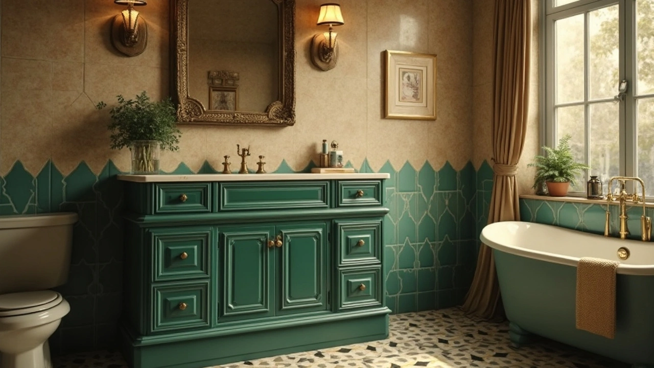
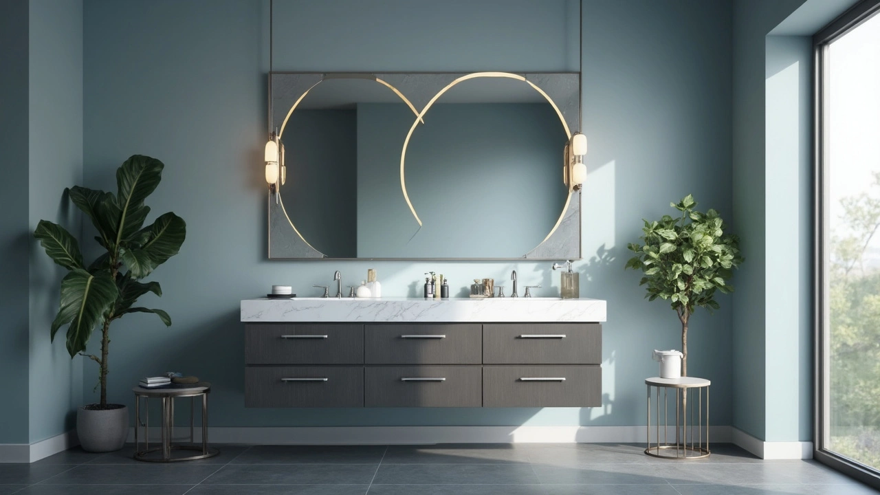
Bold Choices and Modern Trends
Thinking outside the box when picking a vanity color can totally revamp your bathroom. Recently, daring shades like deep navy, emerald green, and even black have become all the rage, giving bathrooms a touch of luxury and drama. These bold hues work best when paired with contrasting elements. Imagine a deep green vanity topped with a crisp white countertop—talk about making a statement!
What's driving this trend? For starters, people are less afraid to break away from traditional whites and beiges. Homeowners are seeking individuality, and a splash of vibrant color on the bathroom vanity can stand out like a piece of art. Adding colors like rich maroon or midnight blue can create a focal point in the bathroom, directing attention where you want it.
Bathroom remodeling enthusiasts also love these bold colors for their versatility in different styles. A glossy black vanity fits perfectly in a modern urban loft, while a muted teal can complement coastal or bohemian themes. The key is finding a balance with the rest of your bathroom elements.
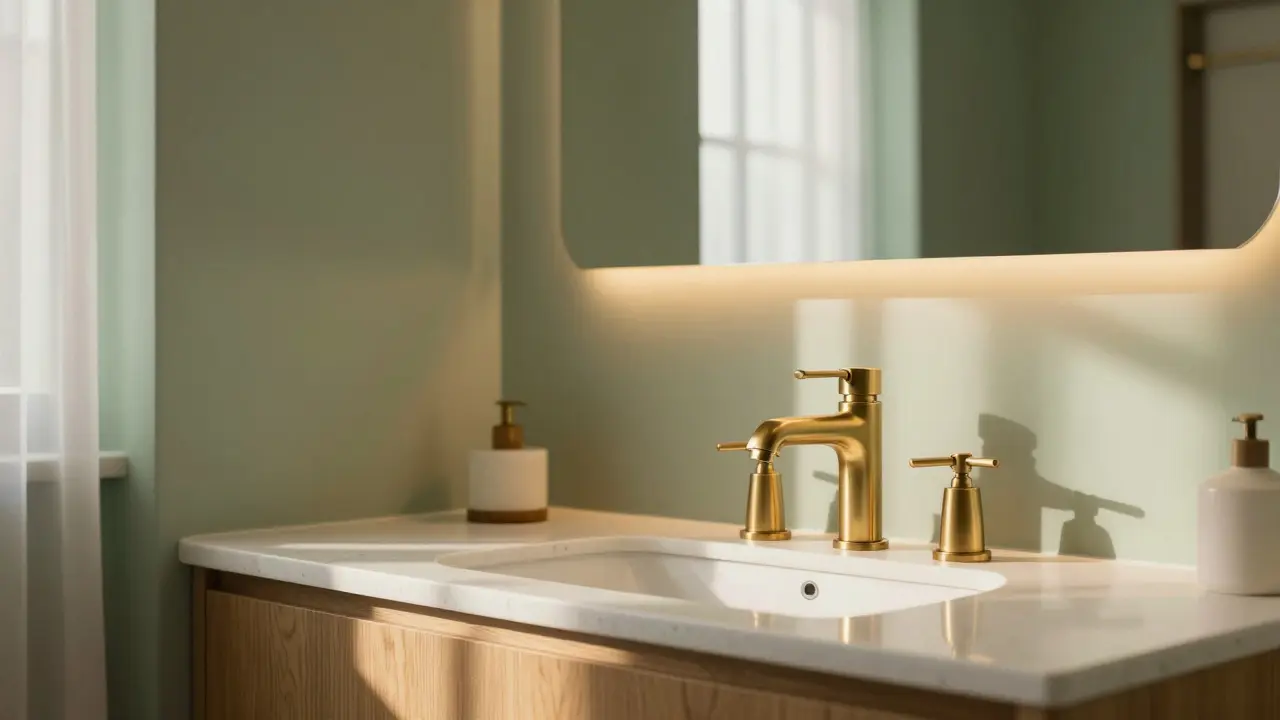
For those keen on knowing what's trending right now, a mix of metallics with bold colors is making waves. Brass handles on a navy vanity, or gold accents with charcoal gray, bring warmth and sophistication. So, don't just settle—experiment to see what clicks! Remember, your bathroom is an expression of you, so let your personality shine through.
Tailoring Your Vanity to Fit Your Space
Your bathroom isn't just a restroom—it's a personal space you visit multiple times each day. So when choosing the right color for your bathroom vanity, think about how it fits into the overall vibe and functionality of your room.
Got a compact bathroom? No worries. Stick to light colors like whites or pastels that can create the illusion of a bigger space. Combining lighter shades with adequate lighting can make even the smallest bathrooms feel airy and spacious. On the other hand, if your bathroom's got room to spare, darker hues like navy or charcoal might add that cozy, sophisticated touch.
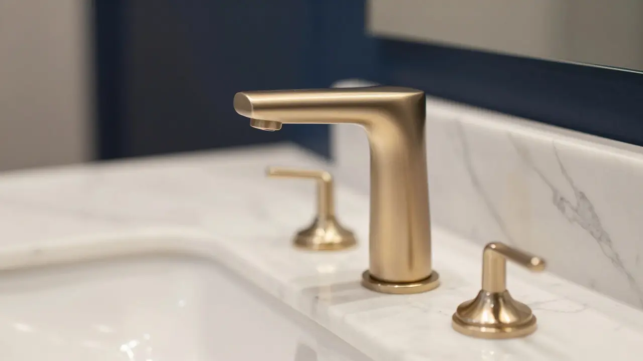
Don't forget about mirrors and storage. A vanity with built-in storage solutions is more than just about keeping things tidy—it's about reflecting your style. Opt for a design that fits your needs without compromising style. Pairing a dark vanity color with sleek silver or gold handles can bring a touch of modernity to a bathroom design.
And here comes the fun part: considering your splash zones! If you're the kind of person who's forever battling water splashes, go for colors and finishes that are splash-friendly. Matte and slightly textured finishes can hide water spots better than glossy ones.
To sum it up, your space dictates your choices, but it’s also an opportunity to inject some personality. Remember these factors and blend them wisely. Whatever your choice, ensure it complements your overall home decor vision.

lucia burton
July 18, 2025 AT 00:58Choosing the right color for bathroom vanities can be more complex than it seems at first glance.
One has to consider the interplay between natural and artificial lighting, as well as the spatial dynamics of the room to prevent the space from feeling cramped or overly austere.
For instance, lighter hues like off-whites or muted pastels invariably augment perceptual spaciousness and create an inviting atmosphere, whereas darker shades like ebony or deep navy lend a certain sophistication but can sometimes constrict visual openness.
Moreover, the finish of the vanity plays a critical role; a high-gloss surface might reflect light beneficially, yet matte finishes tend to provide a more grounded aesthetic that could be more forgiving when it comes to fingerprint smudges and wear. Ultimately, the selection must align not only with aesthetic predilections but also with functional imperatives such as maintenance ease and coherence with existing bathroom hardware.
I'd love to hear if others have had success combining bold color choices with well-thought-out lighting to elevate their bathroom's ambiance?
Denise Young
July 22, 2025 AT 18:51Oh, absolutely, because nothing screams practicality louder than agonizing over shades of white for a bathroom vanity, right?
But I get it, the nuances of color psychology and spatial perception are actually pretty crucial despite how tedious it sounds.
Like, you wouldn’t want a color that makes you feel like you’re stuck in an asylum or a spaceship, unless that’s your aesthetic, of course.
And the whole high-gloss versus matte debate? Classic. I’ve seen vanities that looked stunning until a single fingerprint reminded everyone that reality bites.
So I’m all for those subtle hues with some character, but not so much that it makes cleaning a nightmare later on.
Does anyone have experience with those charcoal greys? They seem like a real wildcard.
Ben De Keersmaecker
July 27, 2025 AT 12:44From a linguistic and cultural standpoint, I find it fascinating how bathroom vanity colors do more than just please the eye; they also metaphorically reflect societal tastes and even regional influences.
For example, in some cultures, white symbolizes cleanliness and purity, which might explain its popularity, whereas darker hues might be perceived as too bold or unconventional.
Moreover, there's an interesting semiotic element to the choice of color in private spaces such as bathrooms.
When selecting vanity colors, are users primarily guided by trends and aesthetics, or do practical factors like light reflection and psychological comfort take precedence?
Understanding this could offer richer insights into design decisions across different demographics.
Has anyone noticed cultural preferences in color usage for bathroom spaces in their travels or home regions?
Jamie Roman
August 1, 2025 AT 06:38Great thread! What I find really compelling is how the ambient lighting in bathrooms works in tandem with vanity colors to either elevate or diminish the overall mood.
In bathrooms with limited natural light, a darker vanity color can create a cozy, intimate vibe, but it needs to be balanced with adequate artificial lights to avoid feeling too shadowy or oppressive.
Conversely, if you have a sunlit bathroom, a bold vanity color could be invigorating without overwhelming the senses. But this balance requires a deep understanding of color theory and space perception, which is not always intuitive for the average DIYer.
Would love to see posts with before-and-after photos showing how different colors and lighting setups affect the bathroom atmosphere. Visual case studies would be super helpful!
Salomi Cummingham
August 6, 2025 AT 00:31I must say, the theatrical potential of bathroom vanities often gets overlooked in design conversations.
The color you choose sets the entire tone of the ritualistic experience—something utterly mundane like washing your hands can suddenly burst into drama or serenity depending on the palette.
For me, a deep teal or emerald vanity acts like a bold character entrance, demanding attention and admiration.
That said, it takes courage to pick colors that break away from the safe whites and greys.
The emotional resonance and the contrast with tiles and fixtures can create captivating narratives within what is essentially a functional room.
It’s an interior drama in miniature, and colors are the lead actors.
Has anyone else ever felt that their bathroom vanity color choice profoundly altered their daily vibe?
Johnathan Rhyne
August 10, 2025 AT 18:24Let me throw in a bit of dissent here—while the obsession with perfect color and lighting is enchanting, let’s not forget that function is king in a bathroom setting.
All the gloss and grandeur mean nothing if the vanity starts peeling in a couple of months because moisture control was overlooked in favor of aesthetics.
And can we talk about how some people misuse the term 'ebony' just because it sounds fancy? Ebony is a specific shade of black linked to a specific wood grain. It isn't just 'dark black.' Precise color naming matters when we're spending hundreds or thousands on bathroom fixtures!
So, sure, pick bold colors—but do your homework on the material properties and overall bathroom humidity. The most gorgeous vanity is worthless if it turns into a damp disaster.
Jawaharlal Thota
August 13, 2025 AT 18:38As someone who frequently advises on home improvement projects, I must emphasize the indispensable role of evaluating lighting conditions before finalizing the vanity color choice.
The variability of natural light throughout the day can cast dramatic shifts on a color’s perception, sometimes leading to unexpected clashes with other design elements.
Moreover, it’s critical to juxtapose vanity color with the undertones present in surrounding tiles, countertops, and cabinetry finishes. A comprehensive color palette assessment prevents the dissonance that can diminish the bathroom’s overall harmony.
Has anyone here tried using color matching technology or apps to refine their vanity color selection? I find digital simulations can avoid costly color missteps.
Andrew Nashaat
August 14, 2025 AT 22:24Oh, dear lord, please, please, for the love of style and sensibility, refrain from the curse of mixing too many hues just for the sake of 'personal taste'!
The last thing a bathroom needs is an aesthetic assault akin to a carnival explosion.
I cannot stress enough the cardinal rule that a vanity color should harmonize, not fight, with the bathroom environment. Black and white combos are timeless for a reason—clarity, balance, and dramatic appeal without chaos.
Folks, please, we stand on the precipice of bathroom design disaster if we keep choosing colors willy-nilly because they’re trendy or “cool.” Thoughtful coordination is not just a recommendation; it’s mandatory.
Can anyone confirm if they’ve rescued a chaotic color scheme by proper adjustment or repainting? I’m curious about success stories.
Gina Grub
August 15, 2025 AT 12:18The drama of color in bathroom vanities is a grand theatre indeed.
Every hue tells a story, and the most mundane fixtures bloom into a spectacle of personality and flair.
Yet, the cynic in me fears the fleeting nature of trends—vanities painted in now-dated palettes that scream early 2010s chic, destined to become the comedic relief in future design retrospectives.
Has anyone here courageously embraced an audacious color choice that they haven’t regretted years later? Or do we all end up in the safe cocoon of neutral tones when the spotlight fades?
Nathan Jimerson
August 16, 2025 AT 02:11Hey everyone! Just jumping in to say that the joy of choosing a bathroom vanity color lies in blending personal optimism with practical knowledge.
I always encourage looking at the space as an opportunity to brighten not just the room but the mood.
Whether it’s a cheerful pastel or a calming ocean blue, colors hold the power to transform daily routines into moments of inspiration.
And remember, the adaptability of paint finishes today makes it easier than ever to update or refresh without a total overhaul.
Has anyone experimented with trend colors for their vanity and been pleasantly surprised by the long-term effect? I’m all ears for good vibes and success stories!