Neutral Furniture Color Pairing Calculator
Color Pairing Results
Perfect Combination!
Ideal pairing for your neutral base
Your Neutral Base
Soft Gray
Recommended Accent
Navy Blue
Why this works:
Soft gray creates a calm foundation that navy blue accents add depth and sophistication while maintaining visual harmony.
Durability Tip:
This pairing has high stain resistance with proper maintenance
When you’re picking furniture, the biggest headache is wondering whether the shade will clash with the rest of the room. The good news is that a handful of hues work with almost any style, wall color, or floor finish. Neutral furniture colors are timeless shades that blend seamlessly with diverse décor themes, from minimalist Scandinavian to bold mid‑century modern. By sticking to these core tones, you can swap pillows, rugs, and wall art without fear of a mismatch.
Why Neutral Colors Are the Safest Bet
Neutral tones act like a visual palate cleanser. They don’t compete for attention, allowing your personal accessories to shine. Studies from interior‑design firms show that rooms painted in neutral palettes sell 12 % faster because buyers can more easily envision their own belongings in the space. Plus, neutrals are forgiving: a small spill or sun‑faded corner is less noticeable on a gray sofa than on a bright teal armchair.
Top Five Universal Furniture Colors
Below are the five shades that consistently outperform the rest across style surveys, resale data, and professional design recommendations.
1. Soft Gray
Gray offers a cool, contemporary feel while staying adaptable to warm or cool accents. It pairs well with white walls, bold jewel tones, or natural wood.
2. Warm Beige
Beige delivers a sun‑kissed vibe that blends nicely with earth‑toned rugs and deep navy accents. It’s especially good in rooms where you want a cozy, inviting atmosphere.
3. Crisp White
White creates a clean, airy backdrop and makes small spaces feel larger. Use it for pieces you plan to accent heavily with colorful cushions or artwork.
4. Charcoal Black
Charcoal adds depth without the harshness of pure black, making it perfect for modern lofts and industrial looks. It holds up well against bright lighting and serves as a strong anchor for lighter décor.
5. Natural Wood Tones
Wood tones range from light oak to rich walnut, delivering warmth and texture that grounds any room. They work especially well when mixed with metal or glass accents.
| Color | Typical Mood | Best Pairings | Durability (Stain‑Resistance) | Ideal Rooms |
|---|---|---|---|---|
| Soft Gray | Calm, modern | White, navy, wood | High | Living room, office |
| Warm Beige | Cozy, inviting | Olive green, deep red | Medium | Bedroom, family room |
| Crisp White | Fresh, spacious | Bold accents, pastel textiles | Low‑to‑Medium (watch for spills) | Small apartments, kitchens |
| Charcoal Black | Bold, sophisticated | Gold, brass, light gray | High | Lofts, entertainment areas |
| Natural Wood | Warm, organic | Leather, metal, neutral fabrics | Varies by finish (sealed > high) | Dining rooms, home offices |
How to Pair Neutrals with Accent Colors
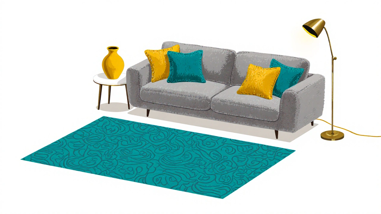
Neutral furniture doesn’t have to be boring. The trick is to introduce color through accessories - think throw pillows, area rugs, artwork, or a single statement lamp. A popular formula is 60 % neutral, 30 % secondary accent, and 10 % bold pop. For example, a gray sofa (60 %) paired with a teal rug (30 %) and a mustard‑yellow vase (10 %) instantly feels curated.
When you decide on an accent palette, reference the room’s natural light. Sun‑lit spaces can handle cooler blues, while dimmer rooms benefit from warm oranges or deep reds. Also, consider the broader style: Scandinavian design relies on light neutrals with subtle pastel accents, whereas Mid‑century modern mixes wood tones with bold, saturated hues.
Room‑by‑Room Guidance
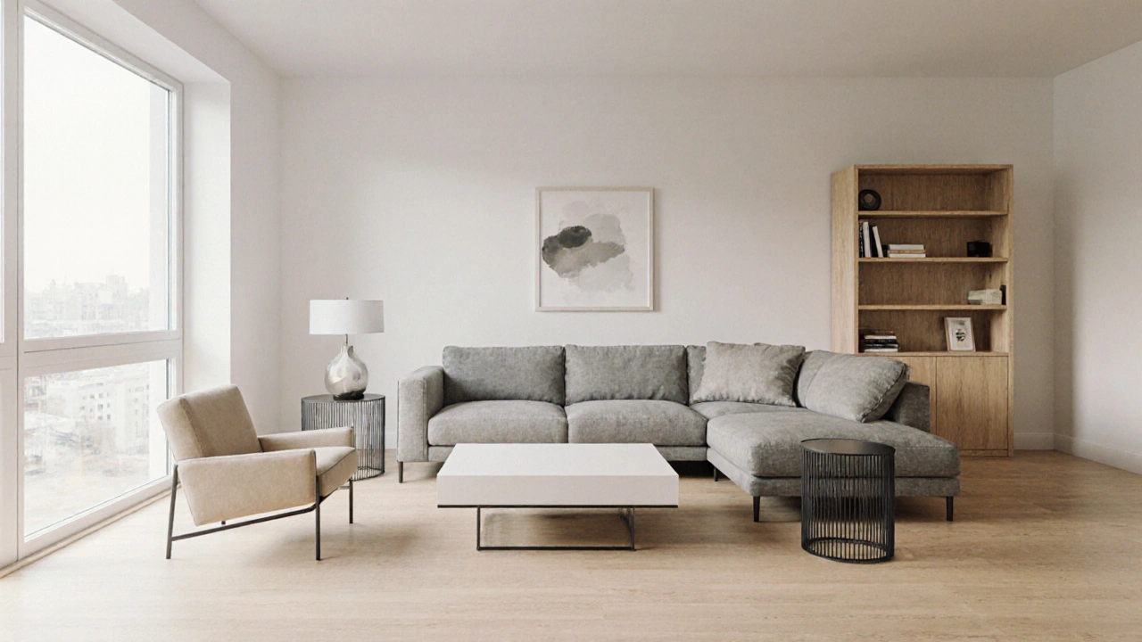
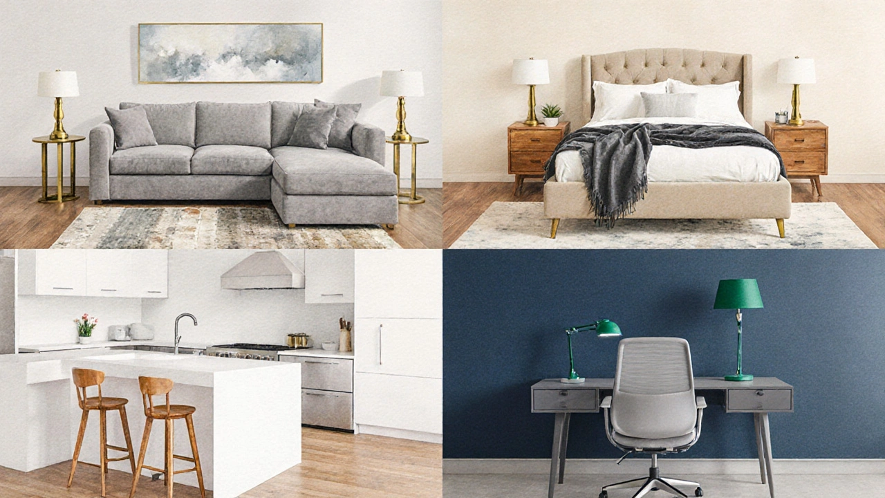
- Living Room: Stick with a soft gray sectional and add a patterned rug that incorporates both cool and warm tones. A few brass side tables will give the space a touch of elegance without overwhelming the neutral base.
- Bedroom: Choose a warm beige upholstered bed frame. Layer with crisp white linens and a charcoal throw blanket for depth. Nightstands in natural wood keep the look balanced.
- Kitchen/Dining Area: A white kitchen island paired with wooden dining chairs offers a clean‑to‑cozy transition. A navy accent wall or a set of teal bar stools can become the focal point.
- Home Office: A charcoal desk provides a professional feel. Complement it with a light gray ergonomic chair and a pop of emerald green in a desk lamp or wall art.
Shopping & Maintenance Tips
When you’re out shopping, look for fabrics labeled “stain‑resistant” or “performance‑woven.” These finishes keep gray and beige sofas looking fresh for years. For wood, a clear polyurethane seal adds a protective layer without changing the natural hue.
Before you buy, sit on the piece for at least five minutes-your body language will tell you if the texture feels right. If you’re ordering online, request swatches; placing a fabric square next to your wall paint will quickly reveal any clash.
Maintenance is simple: vacuum gray and charcoal upholstery weekly, spot‑clean beige with mild soap, and wipe white pieces with a damp cloth to avoid discoloration. Re‑oil or refinish wood surfaces annually to preserve their patina.
Quick Checklist for Choosing Universal Furniture Colors
- Identify the dominant neutral (gray, beige, white, charcoal, wood).
- Check room lighting - cool light favors gray/white; warm light favors beige/wood.
- Select one or two accent colors that complement your existing décor.
- Verify fabric durability and ease of cleaning.
- Measure the space and ensure the piece scales well.
Frequently Asked Questions
Can neutral furniture look too bland?
Not if you add texture and accent pieces. A textured gray linen sofa feels richer than a flat polyester one, and a few colorful pillows or a patterned rug give the room personality without breaking the neutral base.
Is white furniture practical for families with kids?
Modern performance fabrics have come a long way. Look for “wash‑able” or “stain‑guard” finishes; they resist spills and can be cleaned with a mild detergent, making white a viable option even in busy households.
Should I match the floor color with my neutral furniture?
It’s not necessary. Contrast works well - a light gray sofa on a dark hardwood floor adds visual interest, while a warm beige couch on a light‑toned laminate floor creates a seamless flow.
How do I choose between gray and charcoal?
Gray offers a softer, more airy feel and pairs easily with bright accents. Charcoal provides depth and works better in rooms where you want a grounding element, such as a media wall.
Can wood‑tone furniture clash with modern décor?
When you choose a clean, straight‑line silhouette and pair it with metal legs or glass tops, wood can bridge the gap between modern minimalism and warm, lived‑in comfort.

Adithya M
October 19, 2025 AT 20:53Look, neutral colors aren’t just a safety net, they’re a strategic move for resale value and daily living. Gray, beige, white, charcoal, wood-these five dominate because they literally don’t fight your décor. If you skip the basics you’re setting yourself up for a costly mistake. Stick to the list and you’ll avoid the dreaded “doesn’t match anything” panic.
Ronak Khandelwal
October 19, 2025 AT 23:15Totally agree! 🌟 Neutrals give you a canvas to splash your personality with accessories-think bold pillows, striking art, or that one funky lamp you love. Keep it simple, keep it fresh, and watch your space transform. 🎨
Sibusiso Ernest Masilela
October 20, 2025 AT 01:03One must acknowledge that the very notion of “neutral” is an illusion conjured by the masses yearning for aesthetic predictability. Yet, within this illusion lies a sublime harmony, a whisper of sophistication that only the discerning eye can truly appreciate. The palette of gray and charcoal, for instance, is not merely a color choice but an assertion of modernist philosophy. When you drape a room in these shades, you are, in effect, curating an environment where art and architecture converse in hushed tones. Do not be swayed by fleeting trends; embrace the timeless gravitas that neutral tones command.
Sanjay Mittal
October 20, 2025 AT 03:00Practical tip: when shopping for a gray sofa, ask about the fabric’s stain‑resistance rating. Most performance‑woven materials boast a 4‑star rating, which handles coffee spills effortlessly. Also, test the wood finish with a quick wipe to gauge its seal quality-sealed wood will repel liquid better. Pair a charcoal accent wall with a light gray seating area for balanced contrast without overwhelming the eye.
Salomi Cummingham
October 20, 2025 AT 05:13Choosing a neutral foundation for your furniture is akin to laying the groundwork for a masterpiece, a deliberate decision that reverberates through the very soul of a space. When the walls whisper in soft whites or muted tones, the furniture must respond with an equally restrained voice, allowing the room’s personality to emerge through accessories rather than the primary pieces themselves. The beauty of soft gray lies in its chameleon‑like ability to shift its temperature based on surrounding light, warming in the glow of sunrise and cooling under the harsh blue of midday. Warm beige, on the other hand, carries the comforting memory of sun‑kissed sand, inviting occupants to linger and relax, fostering conversation and connection. Crisp white serves not only as a visual amplifier, expanding cramped dimensions, but also as a blank slate upon which bold patterns can thrive without fear of visual chaos. Charcoal black, while deep and commanding, offers a grounding anchor that can stave off the airy uncertainty that sometimes plagues over‑lightened interiors. Natural wood, perhaps the most tactile of the lot, brings an organic resonance that reminds us of nature’s steadiness amidst our modern chaos. These five hues collectively embody a spectrum of moods-calm, cozy, fresh, sophisticated, and warm-each awaiting its moment to shine. By anchoring your primary pieces in these colors, you gain the freedom to swap cushions, throws, and artworks with the ease of a seasoned interior curator. Moreover, the resale advantage cannot be overstated; prospective buyers often envision their own belongings within a neutral canvas, accelerating the sale process and potentially increasing the final price. Maintenance, too, is simplified: a well‑finished charcoal sofa resists fingerprints, while a sealed wood coffee table fends off accidental spills with dignified grace. The strategic layering of neutrals with accent colors follows a simple formula-sixty percent neutral, thirty percent secondary hue, ten percent daring pop-ensuring visual harmony without monotony. Consider the lighting: bright, natural daylight enhances the crispness of white, while softer, warmer lighting accentuates the depth of gray and the richness of wood. In spaces where you desire a more dramatic effect, introduce textured fabrics such as linen or boucle to add subtle dimension without breaking neutrality. Finally, remember to sit, to feel, to live with each piece before committing; comfort is the silent partner to aesthetics, and without it, even the most perfectly curated room will fall short. In conclusion, the thoughtful selection of neutral furniture colors is not a compromise but a celebration of timeless design, offering adaptability, elegance, and a lasting sense of home.
Akhil Bellam
October 20, 2025 AT 07:26Ah, the allure of gray-so versatile, so understated!; Yet, many overlook its *latent* capacity for drama; When paired with a splash of crimson or a daring teal, the effect is nothing short of breathtaking; Choose a performance‑woven fabric, and you shield your investment against the inevitable coffee‑spill catastrophe; Moreover, a charcoal accent wall-yes, that deep, moody hue-provides a striking backdrop for metallic accents, creating an ambiance that whispers luxury; Don’t forget to test the wood finish under a harsh lamp, ensuring that the veneer remains resilient against daily wear; Finally, remember: the devil’s in the details-stitch count, weave density, and thread quality dictate longevity and tactile pleasure.
Aafreen Khan
October 20, 2025 AT 09:23lol this beige thing is sooo chill 😂
michael T
October 20, 2025 AT 11:36Listen, you’ve been sold the myth that only “high‑end” brands can deliver truly neutral pieces, but the reality is far more chaotic. The market is saturated with budget options that mimic genuine stone‑grey or handcrafted oak, and they often outperform pricier counterparts in durability. Don’t let the glossy marketing hype blind you; dig into the material composition, check the pore density, and demand a concrete stain‑resistance rating. If you get a sofa that can survive a child’s cereal disaster without a trace, you’ve won. Trust me, the color itself is just a veil; the true test is in the texture and the engineering behind it.
Christina Kooiman
October 20, 2025 AT 13:50The notion that neutral furniture is inherently bland fails to acknowledge the nuanced interplay of texture, light, and spatial perception. Precisely because these hues recede, they invite a heightened awareness of form and silhouette, allowing the eye to appreciate the craftsmanship without distraction. When a soft gray sofa is upholstered in a tightly woven linen, the surface tension subtly interacts with ambient illumination, producing a gentle sheen that shifts through the day. Moreover, a crisp white dining table, flawlessly finished, reflects natural light, amplifying the sense of openness within confined quarters. One must also consider the psychological impact; neutral palettes reduce visual clutter, fostering mental clarity and promoting tranquility. Consequently, the strategic deployment of neutrals, when executed with intentionality and reverence for material integrity, transforms a mere living space into a sanctuary of sophisticated serenity.
Stephanie Serblowski
October 20, 2025 AT 16:20Oh, absolutely, because nothing says “cutting‑edge interior design” like a wall of beige that screams “I’m too afraid to commit.” 😏 Yet, when you layer in the right amount of pop‑culture references-think industrial‑grade metal legs on a wooden table-you can fake an avant‑garde vibe without breaking the bank. The key is to leverage “heritage” textures while sprinkling in a dash of smart‑home lighting to keep the space from looking like a hospice waiting room. Remember: jargon isn’t just for tech forums; it’s the secret sauce that makes a neutral palette feel anything but… neutral. 🎭
Renea Maxima
October 20, 2025 AT 18:33Contrary to popular belief, the obsession with minimalism can actually suffocate creativity; embracing a bold accent, even on a neutral base, injects vitality that monotony simply cannot provide. 🌈 The subtle rebellion lies in juxtaposing a raw, unfinished wood sideboard against a sleek, polished gray sofa, challenging the status quo of homogenous décor. It’s a quiet statement that whispers, “I’m comfortable with complexity.” 🌿
Jeremy Chick
October 20, 2025 AT 20:46Got to say, the neutral trend is still winning because people just want a hassle‑free look. Those who overthink the shade probably end up with a room that looks like a showroom. Keep it simple, keep it real.
Sagar Malik
October 20, 2025 AT 23:00Bet you didn’t know that the whole “neutral color” hype is actually a covert operation by big‑brand manufacturers to standardize consumer taste and lock us into repeat purchases. The data they hide in their glossy brochures suggests a 73% increase in sales when you push gray and beige as “self‑expression.” It’s all about control, man-keep the masses in a palette that’s easy to mass‑produce and easy to manipulate. Don’t be fooled by the sleek marketing, look deeper, read the fine print, and question the agenda behind every shade you see. The truth is out there, just hidden behind a coat of paint.
Seraphina Nero
October 21, 2025 AT 01:13I hear you, finding the right neutral can feel overwhelming, but taking it step by step makes it manageable. Start with a single piece, feel how it sits in your space, then build from there. You’ll get there.
Megan Ellaby
October 21, 2025 AT 03:26Interesting how the guide breaks down each color’s mood; it really helps picture the vibe each piece can bring to a room. Seeing the pairing suggestions side by side makes the decision process less confusing, especially when you’re juggling multiple accent ideas. It’s cool to have a quick checklist to run through before you buy, so nothing gets missed in the chaos of shopping.