Room Space Calculator
Choose your room characteristics to see which paint colors will make your space appear larger.
Recommended Colors
Why these colors work:
Light colors reflect more light and create the illusion of depth. Cool tones push walls back, while warm tones bring them forward.
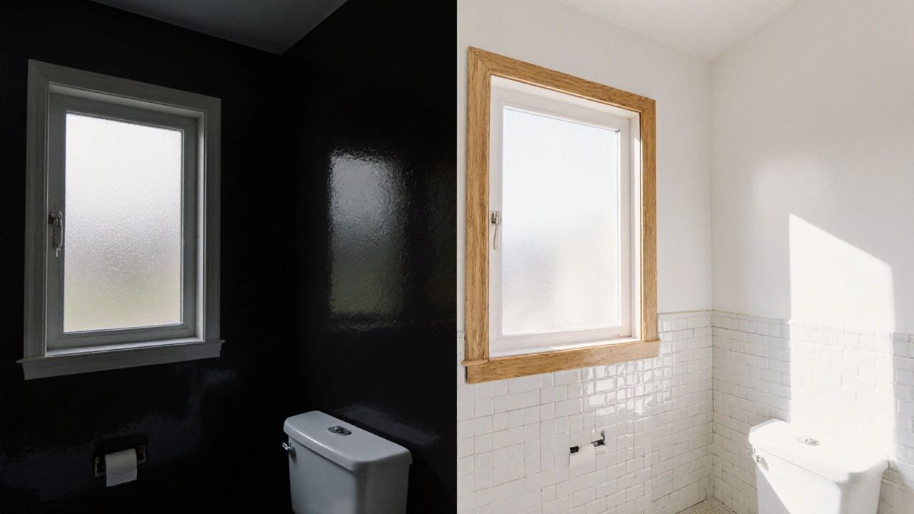
When you stare at a cramped bathroom or a tiny bedroom, the first thing you suspect is that the walls are closing in. The truth is, the right wall paint colors can open up space, brighten a corner, and trick your eyes into seeing a larger area. Whether you’re doing a full bathroom remodel or just freshening up a hallway, choosing the right hue is a simple, low‑cost hack that delivers big visual payoff.
Key Takeaways
- Light, neutral shades reflect more light and create the illusion of depth.
- Cool tones (blues, greens, greys) push walls back, while warm tones (yellows, reds) bring them forward.
- Finish matters: matte or eggshell spreads light evenly; high‑gloss can reflect too much and shrink a space.
- Pair paint with natural light, reflective surfaces, and strategic accent walls for maximum expansion.
- Avoid overly dark or saturated colors in small rooms unless you balance them with bright trim and mirrors.
How Color Shapes Perception
Wall paint color is the specific hue applied to interior surfaces, influencing how light interacts with a room and how the human eye perceives size. Light‑colored walls act like a mirror, bouncing daylight and artificial illumination around the room. This increased reflectance expands the visual field, making the space feel farther away.
In contrast, dark pigments absorb light, pulling the eye inward and shrinking the perceived dimensions. Color temperature also plays a role: cool colors (blue, green, grey) recede, while warm colors (yellow, orange, red) advance. Understanding these basic principles lets you pick a shade that adds depth without sacrificing style.
Another subtle factor is natural light sunlight entering through windows, which amplifies the effect of light paint shades. A room with large windows can handle slightly richer neutrals, whereas a windowless bathroom thrives on the palest whites and off‑whites.
Top Color Families for Making Rooms Look Bigger
Below are the most reliable color families, each with a brief on why they work.
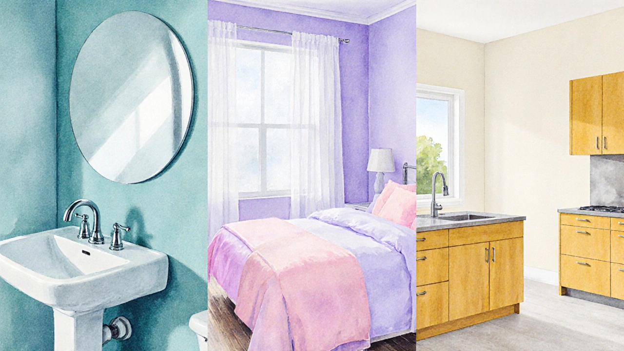
- Light neutrals soft whites, ivory, and beige tones that reflect the highest amount of light. They create a clean canvas that maximizes brightness.
- Cool blues and greens muted sky‑blue, sea‑foam, and sage hues that recede visually, adding a sense of depth. Ideal for bathrooms where moisture‑resistant paints are a must.
- Soft pastels pale lavender, blush pink, or mint that keep the palette light yet add a hint of personality. Works well in bedrooms and powder rooms.
- Warm whites creamy whites with a yellow undertone that feel inviting without closing in the space. Great for kitchens adjoining small dining nooks.
- Strategic dark accents deep charcoal or navy used on a single accent wall to add drama while keeping the rest of the room light. Use sparingly to avoid a shrinking effect.
Practical Tips to Boost the Illusion of Space
Choosing a hue is just the first step. Pair it with these tricks for a truly open feel.
- Maximize natural light. Keep window treatments sheer. If a bathroom lacks windows, install a skylight or a light‑tube to flood the space.
- Mind the finish. Paint finish the sheen level of interior paint, ranging from flat to high‑gloss. Matte, eggshell, or satin are optimal for wall surfaces because they spread light evenly. Avoid high‑gloss in small rooms; it reflects light harshly and can make corners feel recessed.
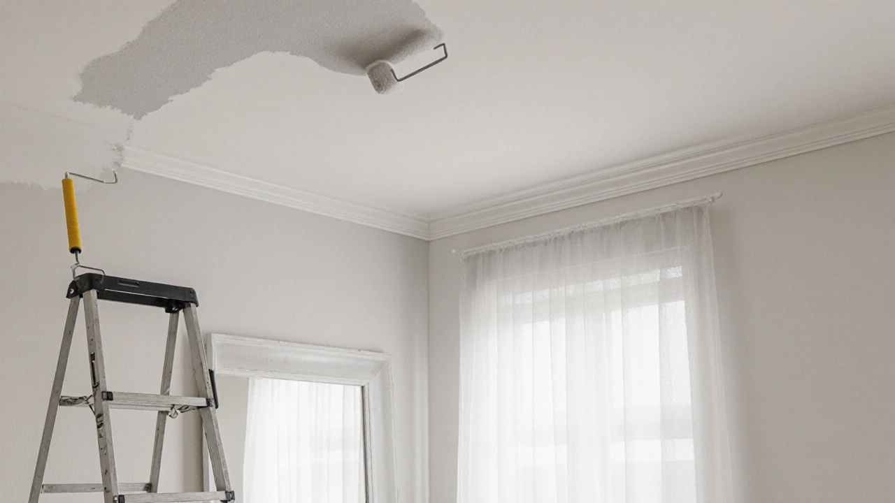
- Paint the ceiling a shade lighter. A ceiling painted one to two shades lighter than the walls pushes the eye upward, adding perceived height.
- Use the same color on the trim. Continuity eliminates visual breaks that can segment a room.
- Introduce reflective accessories. Mirrors placed opposite windows double the amount of light bouncing off walls, amplifying the effect of light paint.
- Consider floor‑to‑wall color continuity. When the floor tile or laminate is a similar light tone to the walls, it creates a seamless plane that expands the visual field.
- Accent wall with caution. If you want a pop of color, paint only one wall in a deeper shade and keep the remaining walls light. Position the accent opposite the main source of light for balance.
Comparison of Popular Color Families
| Color Family | Light Reflectance (%) | Visual Effect | Best Room Types |
|---|---|---|---|
| Light Neutrals | 70‑85 | Maximum openness, bright ambience | Bathrooms, kitchens, small living rooms |
| Cool Blues/Greens | 60‑75 | Receding effect, soothing mood | Bathrooms, bedrooms, powder rooms |
| Soft Pastels | 65‑78 | Light yet personality‑rich | Bedrooms, nurseries, guest baths |
| Warm Whites | 68‑80 | Cozy without enclosing | Kitchens, dining alcoves, entryways |
| Dark Accent (single wall) | 30‑45 | Creates depth focal point | Feature walls, larger bathrooms, lofts |
Common Mistakes to Avoid
Mirror placement positioning reflective surfaces opposite windows to amplify natural light is often overlooked. A mirror placed opposite a dark wall will merely reflect gloom.
- Choosing a shade that’s too close to the ceiling color can flatten the room, removing any sense of height.
- Using high‑gloss paint on all walls makes the space feel like a showroom; it can also highlight imperfections.
- Over‑decorating with bold patterns on small walls competes with the paint’s enlarging effect.
- Ignoring the undertone-warm vs. cool-can clash with existing fixtures like chrome taps or wooden cabinets, creating visual discord.
Step‑by‑Step DIY Painting Guide
- Prep the room. Remove fixtures, cover the floor with drop cloths, and tape edges.
- Test paint samples. Apply 2‑in‑square patches of your top 2 colors on opposite walls. Observe at different times of day.
- Choose the finish. For walls, opt for matte or satin. Use semi‑gloss for trim.
- Prime if needed. Light colors over dark walls benefit from a white primer to boost brightness.
- Paint the ceiling first. A lighter ceiling sets a neutral backdrop.
- Roll walls in ‘W’ pattern. This ensures even coverage and avoids streaks.
- Apply a second coat. Once dry, add a second layer for uniform color.
- Re‑install fixtures. Replace lighting, mirrors, and accessories after the paint cures (24‑48hours).
Next Steps & Troubleshooting
If after painting the room still feels cramped, consider these follow‑ups:
- Upgrade lighting: add LED strips under cabinets or wall sconces to increase overall illumination.
- Swap heavy curtains for sheer panels to let more daylight in.
- Introduce a large mirror opposite the main window; a 4‑ft wide mirror can double perceived width.
- Re‑evaluate flooring contrast. Light‑colored tile or wood that matches the wall hue creates a seamless plane.
- If a dark accent wall feels too dominant, repaint it with a lighter shade and keep the original color for the trim.
Frequently Asked Questions
Do I need a different paint brand for bathrooms?
While any high‑quality interior paint works, bathrooms benefit from moisture‑resistant, mildew‑blocking formulas. These paints contain additives that reduce water absorption and keep the finish smooth in humid environments.
Can I use a dark color in a small bathroom?
Yes, but limit it to one accent wall. Pair the dark wall with light ceiling, trim, and plenty of mirrors. The contrast will create depth without making the room feel closed in.
What paint finish is best for walls that get a lot of scrub‑away?
Satin or semi‑gloss finishes resist stains and are easier to clean than flat paints. They still maintain a soft look while offering durability for high‑traffic bathrooms.
How does ceiling color affect perceived room size?
A ceiling painted a shade lighter than the walls pushes the eye upward, creating an illusion of extra height. Avoid dark ceilings; they draw the eye down and shrink vertical space.
Should I match my floor color to the wall color?
When the floor and walls share a similar light tone, the room appears as one continuous plane, expanding the visual field. For contrast, use a slightly darker floor only if the walls are very light and the room is adequately illuminated.

Scott Perlman
October 10, 2025 AT 01:40Great tips for making a room feel bigger.
Sandi Johnson
October 14, 2025 AT 16:47Oh sure, because painting the walls is exactly what we all dreamed of doing on a Saturday night.
Eva Monhaut
October 19, 2025 AT 07:54There’s something magical about a fresh coat of paint that can turn a cramped bathroom into a breezy oasis, and you’ve captured that feeling perfectly. I love how you broke down the science behind light reflectance, because it makes the whole “why does this work?” question crystal clear. The suggestion to use soft neutrals as a base is spot‑on; they act like a blank canvas that lets the room breathe. Adding a hint of cool blues or greens for a receding effect is a clever touch that keeps the space feeling open without feeling sterile. Pastels, too, bring personality without the visual weight of deeper hues, which is especially useful in bedrooms where you want calm but not dull. Your tip about painting the ceiling a shade lighter than the walls is a subtle hack that many overlook, yet it really does push the eye upward. I also appreciate the reminder to keep trim in the same tone as the walls-continuity is key to avoiding visual breaks. Mirrors opposite windows? Absolutely, they double the light and the sense of space, a classic trick that never gets old. The advice on finish-matte, eggshell, satin-helps people avoid the high‑gloss mistake that can make corners look recessed. I’m glad you warned about over‑decorating small walls; patterns can compete with the illusion of size. The DIY step‑by‑step guide is thorough and practical, especially the part about testing paint patches at different times of day. Including moisture‑resistant paints for bathrooms shows you’ve thought about durability as well as aesthetics. Your table of light reflectance percentages adds a scientific flair that makes the recommendations feel backed by data. The FAQ section hits common concerns directly, like using dark colors in tiny spaces and choosing the right finish for high‑traffic areas. Overall, the article balances technical insight with approachable language, making it useful for both seasoned renovators and first‑time painters. Keep sharing these savvy, budget‑friendly hacks-they truly empower homeowners to transform their spaces without breaking the bank.
mark nine
October 23, 2025 AT 23:00Quick tip: go with a matte or satin finish for walls, it spreads light evenly and hides imperfections better than glossy.
Tony Smith
October 28, 2025 AT 13:07It is indeed a marvel how the entire complexity of interior design can be distilled to a single color choice, as if the rest of the room were merely an afterthought.
Ronnie Kaye
November 2, 2025 AT 04:14Wow, never thought a paint swatch could be the superhero we need to save our tiny apartments-so much drama in a single brushstroke.
Tamil selvan
November 11, 2025 AT 10:27Indeed, the selection of a light neutral base, coupled with strategic lighting, can profoundly augment the perceived expansiveness of a room; moreover, the recommendation to match floor tones to wall colors, while subtle, contributes significantly to a seamless visual plane, thereby enhancing the overall sense of openness.
Mark Brantner
November 16, 2025 AT 01:34I aint no pro but this paint thing is def a game changer, just make sure u dont go too dark or ur room will feel like a cave lol.