Remember when every living room had that same dull beige sofa? Or when dark walnut cabinets dominated kitchens like they were going out of style-because they were? Color trends in furniture don’t just change; they cycle, crash, and sometimes come back with a vengeance. But right now, in early 2026, certain hues are officially out of favor-not because they’re ugly, but because they feel dated, overused, and out of sync with how people actually live today.
Beige Is No Longer the Safe Default
Beige used to be the go-to for furniture because it was "neutral" and "timeless." But in 2026, that’s not true anymore. Too many homes still have beige sectionals, beige armchairs, beige rugs. And now, they look like they were picked in 2012. Beige doesn’t hide dirt anymore-it screams it. It also lacks depth, contrast, and personality. Modern interiors want warmth, not blandness. People are moving toward warm grays, soft taupes with undertones of olive or rust, and even muted terracottas that feel alive. Beige without character? It’s just empty space dressed up.
Dark Walnut Furniture Feels Heavy and Old-Fashioned
Dark walnut cabinets, dining tables, and bookshelves were everywhere in the 2010s. They looked expensive. They looked traditional. But now, they look like they belong in a 1990s suburban home with wood paneling and shag carpeting. The problem isn’t the wood-it’s the finish. That deep, glossy, almost black walnut tone absorbs light instead of reflecting it. In homes with open floor plans and lots of natural light, dark walnut makes spaces feel smaller, heavier, and colder. Today’s preference is for lighter woods: ash, oak with a natural oil finish, or even whitewashed pine. These options keep the grain visible but let the room breathe.
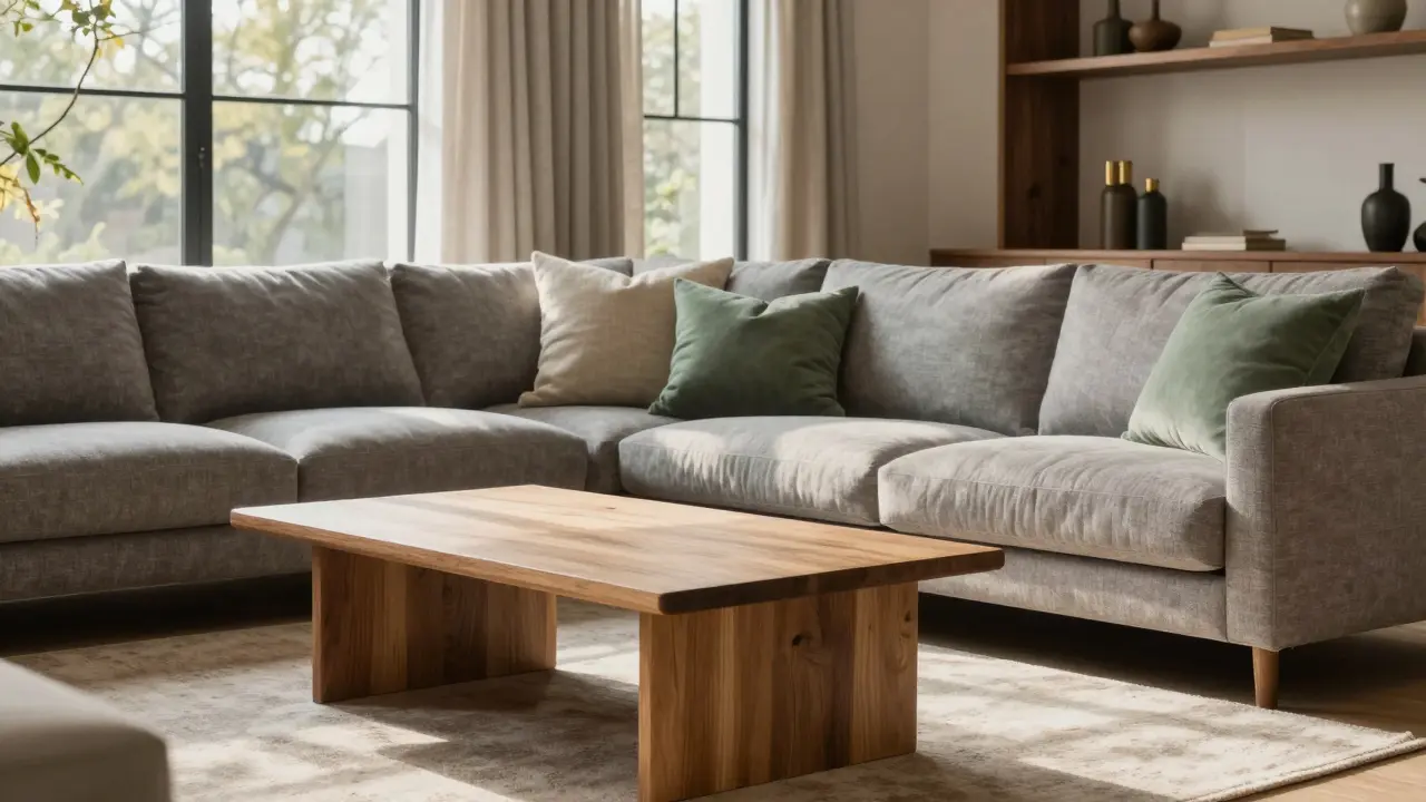
Neon and Overly Saturated Accent Pieces Are Out
Remember when everyone added one neon green chair or a hot pink ottoman to "add some life" to a room? In 2026, that’s not bold-it’s chaotic. Those saturated colors don’t age well. They look like they came from a discount store clearance bin. They clash with the softer, more intentional palettes people are choosing now. Even if you love color, the trend has shifted to muted, earthy tones with subtle vibrancy-think dusty sage, faded coral, or deep moss green. These colors feel curated, not accidental. If you want a pop, go for a single piece in a rich, low-saturation tone, not a fluorescent shock.
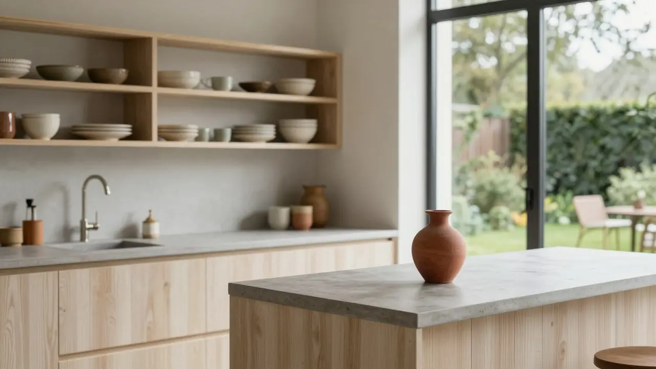
Marble-Top Coffee Tables Are Losing Their Appeal
Marble was the ultimate luxury material for coffee tables and console tables for over a decade. But in 2026, it’s becoming a liability. Real marble stains easily, etches from lemon juice or wine, and requires constant sealing. And faux marble? It looks cheap under bright LED lighting. People are switching to solid wood, concrete, or ceramic tops with matte finishes. These materials are durable, easier to maintain, and feel more grounded. A coffee table made of reclaimed oak with a natural oil finish doesn’t scream "I spent a fortune," but it whispers "I know what I’m doing."
Chintzy Floral Patterns Are Gone
Floral upholstery was once a sign of cozy, feminine style. But the kind with tiny, overly detailed roses on a cream background? That’s now firmly in the "grandma’s living room" category. It feels fussy, dated, and hard to pair with modern lines. Today’s patterned furniture leans toward abstract geometrics, organic brushstrokes, or subtle tonal textures. A sofa with a soft, hand-painted stripe in two shades of charcoal? That’s in. A pillow covered in 18th-century floral embroidery? That’s not.
Why These Colors Are Falling Out of Favor
It’s not just about aesthetics-it’s about lifestyle. People aren’t just decorating homes anymore; they’re building sanctuaries. After years of remote work, hybrid schedules, and spending more time indoors, there’s a demand for calm, cohesive environments. Overly bright, overly dark, or overly ornate furniture disrupts that. The goal now is balance: warmth without clutter, color without chaos, texture without fuss.
Also, social media plays a role. Instagram and Pinterest used to push "aesthetic" rooms full of beige and dark wood. Now, the most-liked interiors are airy, layered, and full of muted tones. People are copying what feels real-not what looks like a catalog.
What’s Replacing the Outdated Colors
If you’re tired of the old palette, here’s what’s working now:
- Warm grays instead of beige-think "greige" with a hint of brown, not cool gray.
- Muted greens like sage, olive, or moss for sofas and armchairs.
- Soft terracotta and clay tones for accents and rugs.
- Light oak and ash for tables and cabinets-natural, unfinished, or lightly oiled.
- Blackened steel and matte brass for legs and hardware-clean, industrial, but warm.
These colors don’t fight each other. They layer. They breathe. They age gracefully.
How to Update Your Furniture Without Buying Everything New
You don’t need to replace your whole living room to get rid of outdated colors. Start small:
- Swap out throw pillows and blankets for ones in muted earth tones.
- Reupholster a single chair or ottoman in a soft green or warm gray fabric.
- Paint dark wood furniture with a chalk-based paint in a light taupe-no sanding needed.
- Add a large, neutral rug to ground the space and soften harsh colors.
- Replace metal hardware on cabinets or dressers with matte black or brushed brass.
These changes cost less than $500 and can completely reset the vibe of a room.
Final Thought: It’s Not About Trends-It’s About Feeling
Colors go in and out of style, but good design lasts. The reason beige and dark walnut feel outdated isn’t because they’re technically wrong. It’s because they no longer make people feel calm, comfortable, or at ease. Your home should reflect how you want to live-not what a magazine told you to buy ten years ago. If a piece of furniture makes you sigh when you walk in, it’s time to let it go. Not because it’s "out of style." But because you deserve better.
Is beige furniture completely dead in 2026?
Not completely, but plain, flat beige is. If your beige has texture-like linen, bouclé, or a subtle weave-it still works. The problem isn’t the color; it’s the lack of depth. Look for beige with warm undertones, like taupe or oat, and pair it with natural materials like wood or stone.
Can I still use dark wood furniture?
Yes, but avoid glossy, heavy walnut. Opt for matte-finished dark walnut or go for darker stains on lighter woods like walnut or cherry. Pair it with plenty of light, mirrors, and soft textiles to keep the space from feeling closed in.
What’s the most popular color for sofas in 2026?
Warm gray and muted sage are the top two. Both are versatile, calming, and pair well with natural materials. Many people choose these colors because they work with both modern and rustic styles, making them future-proof.
Are pastels still in style for furniture?
Soft pastels like blush or powder blue are okay if they’re muted and paired with neutral bases. But bright pastels-like baby pink or sky blue-are out. They look dated and don’t hold up well over time. Stick to tones that are closer to earth colors.
How do I know if my furniture is outdated or just old?
Ask yourself: Does it make the room feel heavy, cluttered, or visually noisy? Does it clash with natural light? Do you feel relieved when you leave the room? If yes, it’s not just old-it’s working against you. Good furniture should feel like a quiet companion, not a loud statement.

Ray Htoo
January 18, 2026 AT 02:33Finally someone gets it. Beige isn’t dead-it’s just been exposed as the emotional blank space it always was. I swapped my beige sectional for a warm greige bouclé last fall and my apartment finally stopped feeling like a hospital waiting room. Also, matte brass legs on everything? Chef’s kiss.
Veera Mavalwala
January 18, 2026 AT 12:50Oh honey, you think beige is bad? Wait till you see what’s happening in the resale market. People are dumping their dark walnut dining sets like they’re haunted. I bought a 1998 walnut table for $80 last month-it had a chip in the corner and smelled like my ex’s cologne. I sanded it down, stained it with walnut oil and tung oil blend, and now it’s the centerpiece of my living room. You don’t kill a good tree, you just give it new breath. And yes, I did cry while sanding. It was therapeutic.
Also, marble tops? Please. My cousin’s white Carrara table got a wine stain from a Tuesday night Netflix binge and now looks like a crime scene. I switched to reclaimed oak with a matte finish. It’s warm, it ages like fine whiskey, and it doesn’t require a PhD in stone maintenance. If you’re still using faux marble, you’re not decorating-you’re performing.
And floral patterns? That’s not decor, that’s a time capsule. I saw a pillow the other day with roses so detailed you could count the petals. I wanted to burn it. Not because I hate flowers-I love them-but because that level of detail is a cry for help. Abstract brushstrokes? Yes. A single muted sage stripe? Yes. A 1987 floral nightmare? No. No. No.
And don’t even get me started on pastels. Baby pink? That’s not a color, that’s a cry for attention from a 14-year-old who just discovered Tumblr. Soft blush? Maybe. But only if it’s the color of dried rose petals after a monsoon. That’s the vibe. Earthy. Quiet. Alive. Not like a bubblegum factory exploded in a nursing home.
People think trends are about aesthetics. They’re not. They’re about energy. Your furniture should feel like a deep exhale, not a scream from 2013. And if you’re still using velvet? Please. Velvet is the interior design equivalent of a man in a suit at a beach party. It’s not wrong-it’s just deeply, profoundly misplaced.
Kieran Danagher
January 19, 2026 AT 11:44Marble is a liability? Tell that to the guy who spent $12k on a slab and now can’t even wipe it with water without panicking. Meanwhile, my $200 concrete table from IKEA looks like it was carved by a zen monk and hasn’t chipped since 2020. Sometimes the cheapest thing is the most elegant.
Shivam Mogha
January 20, 2026 AT 02:48Beige with texture works.
OONAGH Ffrench
January 21, 2026 AT 16:27Design is not about trends it is about resonance the furniture you live with should feel like silence made visible
Patrick Sieber
January 23, 2026 AT 13:02Love this breakdown. I’ve been telling my sister for years that her ‘neutral’ living room is just a beige void. She finally listened and reupholstered her armchair in a dusty sage linen. Now she says she actually wants to sit in it. That’s the win.
Sheetal Srivastava
January 24, 2026 AT 18:06Let’s be real-this is just a curated illusion for Instagram influencers who have no idea what real life looks like. Who has time to reupholster? Who has the money to replace furniture every two years? This isn’t design-it’s performative capitalism disguised as mindfulness. And don’t even get me started on ‘warm grays’-that’s just beige with a therapist.
Sheila Alston
January 26, 2026 AT 05:15I’m not saying you’re wrong, but I think you’re missing the point. Beige isn’t the enemy-it’s the lack of intention behind it. My grandmother’s beige sofa had a hand-knitted throw and a stack of well-loved books beside it. It felt like safety. Now we replace it with ‘warm gray’ because it’s trending, not because it makes us feel anything. Maybe the problem isn’t the color-it’s how we’ve forgotten how to live in our spaces.
mani kandan
January 27, 2026 AT 05:01There’s a quiet wisdom in letting materials age naturally. I have a dark walnut side table from my grandfather-it’s scratched, stained, and slightly wobbly. But it holds stories. The key isn’t to reject dark wood-it’s to stop treating it like a museum piece. A little oil, a little light, and it becomes part of the home, not a monument to past trends.
Rahul Borole
January 28, 2026 AT 23:52It is imperative to recognize that the evolution of interior design paradigms reflects broader sociocultural shifts toward mindfulness, sustainability, and intentional living. The rejection of over-saturated palettes and non-durable materials is not merely aesthetic-it is an ethical imperative. One must prioritize materials that demonstrate longevity, low environmental impact, and emotional resonance. The home is not a stage-it is a sanctuary.
poonam upadhyay
January 30, 2026 AT 08:24Okay but have you considered the psychological implications of warm gray? It’s not just a color-it’s a symptom of late-stage capitalism’s attempt to pacify us with soothing neutrals while we’re drowning in debt, climate collapse, and algorithmic loneliness. And don’t even get me on the ‘muted sage’ movement-it’s just beige pretending to be woke! Also, who gave you the right to say floral is outdated? My grandma’s chintz couch held me during my divorce. You can’t just erase trauma with a Pinterest board.
Also, why are all these ‘experts’ white? Where are the BIPOC perspectives? My aunt’s living room is all burnt orange and gold embroidery and it’s the most alive space I’ve ever been in. You’re not updating your home-you’re erasing culture.
And why is ‘matte brass’ suddenly chic? Because some influencer in Brooklyn said so? That’s not design-that’s tribal signaling. I’m not buying a coffee table because it whispers ‘I know what I’m doing.’ I’m buying it because it makes me feel like I’m home. Not like I’m in a catalog.
sampa Karjee
February 1, 2026 AT 00:34You call it ‘muted’-I call it cowardly. Design used to be about boldness. Now it’s about blending in. You want ‘calm’? Try living in a museum. My house is full of color, pattern, texture, and chaos. And it’s alive. You can’t ‘breathe’ in a room that looks like a meditation app.
Natasha Madison
February 1, 2026 AT 06:53They’re coming for your furniture next. First they take your beige couch. Then your dark wood. Then your marble. Then they’ll tell you your curtains are ‘too floral’ and your rug is ‘too ethnic.’ Next thing you know, they’ll be forcing you to paint your walls ‘calm beige’ and ban all personal artifacts. This isn’t design. It’s cultural homogenization. And they’re using ‘wellness’ as the cover. Watch.