There’s no single rule for bathroom colors, but there are proven patterns that work-every time. If you’ve ever stood in a paint store staring at 50 shades of white, you know it’s not just about what looks nice. It’s about how light bounces, how steam clings, how small the space feels, and how you feel stepping out of the shower. The right color doesn’t just hide dirt-it changes your whole morning routine.
Why Bathroom Color Matters More Than You Think
Bathrooms are the smallest rooms in most homes, but they’re the most used. You’re in there five to seven times a day, often half-asleep or rushing. That’s why color isn’t decorative here-it’s functional. A dark bathroom feels cramped and cold. A too-bright one feels clinical. The goal isn’t to match your living room-it’s to create a space that feels calm, clean, and easy to live with.
Studies from the Journal of Environmental Psychology show that cool tones like soft blues and greens lower heart rate and reduce stress. That’s not just marketing. It’s biology. When you step out of a hot shower, your body is still in recovery mode. A warm, muddy brown or a neon green doesn’t help. It overstimulates. A muted sage or a pale gray? That’s your body’s reset button.
The Real Rule: Light, Moisture, and Size
The real rule for bathroom colors isn’t about trends or Pinterest boards. It’s about three things: how much natural light you have, how much moisture stays in the air, and how big the room actually is.
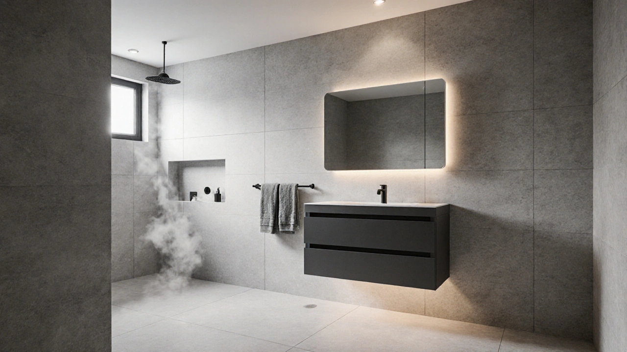
If your bathroom has a small window or no window at all, go light. Not white-light. Think off-white with a hint of gray, or a barely-there blue. These colors reflect what little light you have without making the space feel sterile. Dark colors in a windowless bathroom? They’ll make it feel like a cave. Even if you love charcoal, save it for the powder room, not the master bath.
Moisture is the silent killer of paint. Bathrooms have humidity levels that can spike to 80% after a shower. That’s worse than a sauna. Paint that isn’t designed for high moisture will peel, bubble, or grow mold in months. Always use 100% acrylic latex paint labeled for bathrooms. It’s flexible, washable, and resists mildew. No exceptions. And don’t forget the ceiling. It’s the first place mold shows up.
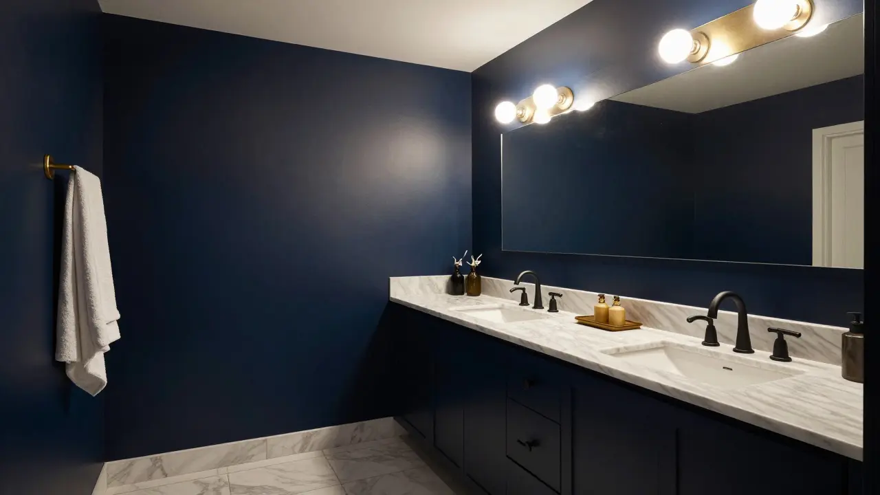
Small space? Stick to one color from floor to ceiling. No accent walls. No contrasting trim. A single tone creates visual continuity. It tricks your eye into thinking the room is bigger. A 5x7 bathroom painted in two colors looks like a box with a divider. One color? It flows. Even if it’s a deep navy-if it’s consistent, it feels intentional, not cramped.
What Colors Actually Work? Real Examples
Let’s cut through the noise. Here are the five bathroom colors that work in 9 out of 10 homes, backed by real installations and homeowner feedback from the past two years:
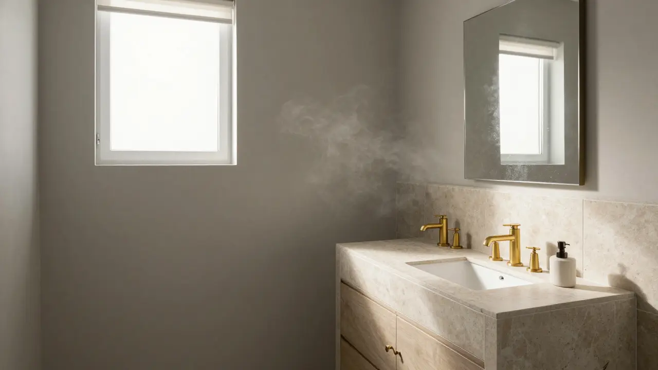
- Soft Gray (Benjamin Moore Revere Pewter) - This isn’t cold. It’s warm gray with a touch of beige. Works in sunlit and windowless bathrooms. Pairs with brass, chrome, or matte black fixtures. No one ever regrets this.
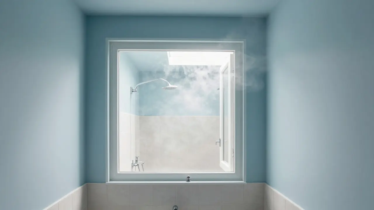
- Pale Blue (Sherwin-Williams Sea Salt) - Not turquoise. Not navy. A soft, misty blue that feels like morning air. It’s calming without being sleepy. Popular in master bathrooms with natural stone tiles.
- Warm White (Benjamin Moore White Dove) - Not pure white. This has a hint of yellow. It doesn’t look dingy under fluorescent lights. The most popular choice for small bathrooms in condos and apartments.
- Muted Green (Sherwin-Williams Sage Green) - For people who want personality without drama. Works with wooden vanities and terracotta tiles. Feels spa-like, not like a 1970s bathroom.
- Black (Benjamin Moore Black Panther) - Only if you have good lighting and a large space. Used as an accent wall or on cabinetry. Not on the ceiling or floor. Looks luxurious, not gloomy, when paired with brass fixtures and marble.
These aren’t trends. They’re fixes. People who used them report feeling less stressed, taking longer showers, and actually enjoying the space. One client in Burlington told me she started meditating in her bathroom because it felt so peaceful. That’s the goal.
Colors to Avoid (Even If They’re Popular)
Some colors look great in magazines. They’re terrible in real life.
- Pure White - It’s not a color. It’s a warning sign. It shows every water spot, toothpaste smear, and hair. It makes your bathroom look like a hospital. Use off-white instead.
- Neon or Bright Colors - Hot pink, lime green, electric blue. They’re fun for a kid’s bathroom, not yours. They tire your eyes after a week. You’ll repaint in six months.
- Dark Brown or Red - These feel heavy and outdated. Even in a luxury bathroom, they make the space feel smaller and older. They’re not modern. They’re nostalgic-and not in a good way.
- Too Many Colors - Accent walls, patterned tiles, colored grout, and contrasting vanities? That’s not design. That’s chaos. Stick to one main color. Add texture, not more hues.
How to Test Colors Before You Paint
Don’t buy paint based on a swatch. That’s how you end up with a bathroom that looks like a clown car.
Here’s what to do:
- Buy sample pots. Not mini cans-actual 8-ounce samples. They cost $5 and cover a 2x2 foot area.
- Paint three different spots: one near the window, one in the corner, and one on the wall across from the mirror.
- Live with it for 3 days. Look at it in morning light, afternoon light, and under your bathroom bulbs.
- Watch how it changes. Does it look gray at noon and blue at dusk? That’s fine. That’s the color you want.
- If you still love it after three days? Paint the whole room.
This is how professionals do it. No one guesses. No one rushes. And no one regrets it.
Fixtures and Finishes: The Silent Partners
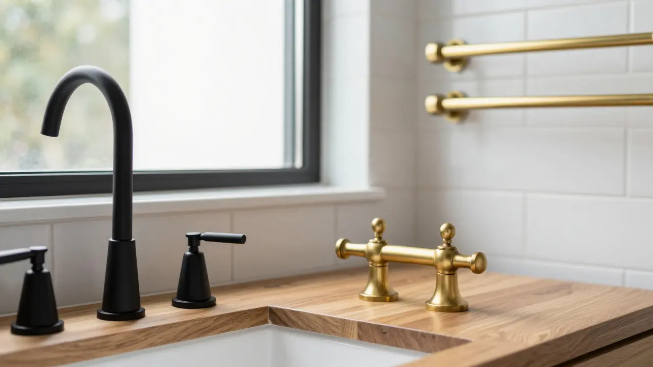
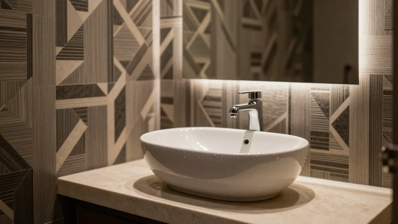
Your paint color doesn’t work alone. It talks to your fixtures. A cool gray looks sharp with chrome. It looks dull with brushed nickel. A warm white sings with brass. It gets muddy with oil-rubbed bronze.
Match your color to your hardware, not the other way around. If you have brass faucets, go for warm tones. If you have matte black, you can go cooler. If you’re replacing fixtures anyway, pick the color first. Then match the hardware to it. That’s the right order.
Tile matters too. White subway tiles with gray walls? Classic. Dark tile with a dark wall? Risky. It can look like a cave. Light tile with a dark wall? That’s a bold statement. Only do it if you know what you’re doing.
What About Trends? Should I Follow Them?
2025’s “it” color? Doesn’t matter. Trends come and go. The color that makes your morning routine better? That lasts.
Yes, earthy tones are popular. Yes, dark bathrooms are trending. But trends don’t care if your bathroom has no windows. They don’t care if your shower is 3 feet wide. They don’t care if you have two kids and a dog.
Choose based on your life. Not Instagram. If you want a dark bathroom, fine. But make sure you have good lighting, ventilation, and enough space. Otherwise, you’ll be redecorating in two years.
Final Thought: It’s Not About Color. It’s About Feeling.
The rule for bathroom colors isn’t in a book. It’s in how you feel when you walk in.
Does it feel like a place to breathe? Or a place to escape? Does it make you want to linger, or do you just want to get out? That’s the test.
There’s no perfect color. But there’s a perfect one-for you. And it’s not the one everyone else is using. It’s the one that makes your bathroom feel like your own.
Can I use dark colors in a small bathroom?
Yes, but only if you have strong lighting and reflective surfaces. A dark wall with a large mirror, bright overhead lights, and light-colored tiles can work. But avoid dark floors and ceilings-they make the room feel smaller. Dark colors in small bathrooms work best as accents, not the whole scheme.
What’s the best white for a bathroom?
Avoid pure white. Use off-whites like Benjamin Moore White Dove or Sherwin-Williams Alabaster. These have subtle warmth that prevents the room from looking cold or sterile. They also hide dirt better than bright white.
Should I paint the ceiling the same color as the walls?
Yes, especially in small bathrooms. Painting the ceiling the same color as the walls creates a seamless look that makes the space feel taller and more open. If you’re using a light color, you can even go slightly lighter on the ceiling to add depth without breaking the flow.
Is gray still a good choice for bathrooms in 2026?
Absolutely. Gray remains one of the most versatile bathroom colors because it’s neutral without being boring. Soft grays with warm undertones work well with almost any fixture and tile. The key is choosing the right shade-not the cool, icy grays that feel clinical.
How do I choose a color if I have colored tiles?
Match your paint to the undertones in the tile. If your tiles have green or blue flecks, pick a paint with similar undertones. If they’re warm beige or cream, go for a warm white or soft gray. Don’t fight the tile-work with it. The goal is harmony, not contrast.

Abert Canada
January 28, 2026 AT 20:56I grew up in a bathroom with lime green tiles and a cracked tub. My mom said it was 'vibrant.' I say it was a trauma trigger. This post got me to finally repaint mine in Revere Pewter. No regrets. I actually sit in there now with my coffee. Weird, right?
Xavier Lévesque
January 28, 2026 AT 23:38So let me get this straight. You’re telling me I shouldn’t paint my bathroom neon green because I might get tired of it? Groundbreaking. Next you’ll tell me not to drink bleach.
Thabo mangena
January 29, 2026 AT 01:19It is with great respect for the psychological implications of interior design that I acknowledge the wisdom presented herein. The biological response to chromatic stimuli in confined, moisture-laden environments is not merely aesthetic-it is existential. One must choose with the soul as much as the eye.
Karl Fisher
January 29, 2026 AT 18:49Oh wow. You actually used ‘Benjamin Moore Revere Pewter’ like it’s a sacred text. I mean, I get it, but I painted mine matte black with gold fixtures and now I feel like I’m in a James Bond villain’s lair. And guess what? I love it. The ‘rules’ are just suggestions for people who don’t know their own taste.
Buddy Faith
January 30, 2026 AT 08:37the government made you think gray is safe. they dont want you to feel joy. neon green is freedom. the mold? just a sign you’re living. paint your ceiling black. let the light fight for its life
Scott Perlman
January 30, 2026 AT 13:01I did the sample test. Three days. Looked at it at night. In the sun. With the lights on. I stuck with White Dove. Best decision ever. My wife cried. Not because it was pretty. Because she finally didn’t have to scrub toothpaste off the walls every week.
Sandi Johnson
January 30, 2026 AT 15:48Oh so now we’re supposed to ‘match our paint to our hardware’? Next you’ll tell me to wear socks that match my underwear. I’ve got brass faucets and a wall painted like a sad avocado. And I’m not changing a thing. Let the chaos reign.
Eva Monhaut
January 31, 2026 AT 14:38I painted my tiny bathroom Sage Green after reading this. I didn’t think it would work-it’s so small, I kept imagining it swallowing me. But now? When I step out of the shower, it feels like walking into a forest after rain. No one talks about how color can be a quiet kind of therapy. This isn’t design. It’s healing.
mark nine
February 2, 2026 AT 10:27Dark colors in small bathrooms? I did it. 5x7 room. Black walls. White tiles. Big mirror. LED strip lights. Looks like a spaceship. People ask if I’m a designer. I just liked the vibe. Works. Don’t overthink it.
Tony Smith
February 3, 2026 AT 01:07While I appreciate the empirical approach to chromatic selection in domestic micro-environments, I must respectfully submit that the notion of ‘one color from floor to ceiling’ is a reductive heuristic. One’s aesthetic autonomy must not be subjugated to spatial geometry. I, for instance, employ a tripartite chromatic strategy with complementary tonal gradients. It is, in fact, quite sophisticated.
Rakesh Kumar
February 4, 2026 AT 21:26I live in Mumbai. My bathroom has no window. No AC. Just a fan that sounds like a dying dragon. I painted it White Dove. Now I don’t feel like I’m in a sweaty closet. I just want to say thank you. This post changed my life. Also, I bought a new towel. It’s blue. Like the sky I miss.
Bill Castanier
February 6, 2026 AT 04:40Paint samples are non-negotiable. You don’t buy shoes without trying them on. Don’t paint without testing. Also, ceiling same color as walls. Always. It’s not a trend. It’s physics.
Ronnie Kaye
February 7, 2026 AT 12:32Okay but what if your bathroom is 4x4 and you have a toddler who paints on the walls with crayons? I painted it white. Then my kid turned it into a masterpiece. Now I call it ‘abstract expressionism.’ The mold? That’s just texture. I’m not repainting. I’m curating.
Priyank Panchal
February 8, 2026 AT 00:40You say avoid dark brown. But in my country, dark wood and deep tones mean wealth. You think your gray is modern? Mine is tradition. You don’t get to tell me what feels right in my home just because you read a blog.