Think about the last time you walked into a bathroom and felt like you needed sunglasses. Maybe it was a bright neon green, or a dusty lavender that looked like it hadn’t changed since 1998. You didn’t just notice the color-you felt it. That’s because bathrooms are small, enclosed spaces where color hits you harder than anywhere else in the house. And while bold choices work in living rooms or kitchens, some colors in a bathroom don’t just look bad-they make the space feel smaller, dirtier, or just plain off-putting.
Why Color Matters More in Bathrooms
Bathrooms are the smallest rooms in most homes, but they’re also the most used. You’re there first thing in the morning, last thing at night, and often in low light. The walls, floor, and fixtures all work together to shape your mood. A bad color doesn’t just look ugly-it can make you feel tired, anxious, or even sick. That’s not an exaggeration. A 2023 study by the Color Research Institute found that people spending more than 15 minutes daily in a bathroom with saturated, cool-toned colors reported higher stress levels than those in neutral or warm spaces.
And here’s the kicker: bathrooms don’t get a lot of natural light. Even in sunny homes, mirrors, towels, and shower curtains block what little sunlight gets in. That means the paint color you choose has to do double duty-it has to look good in artificial light and still feel clean and calm.
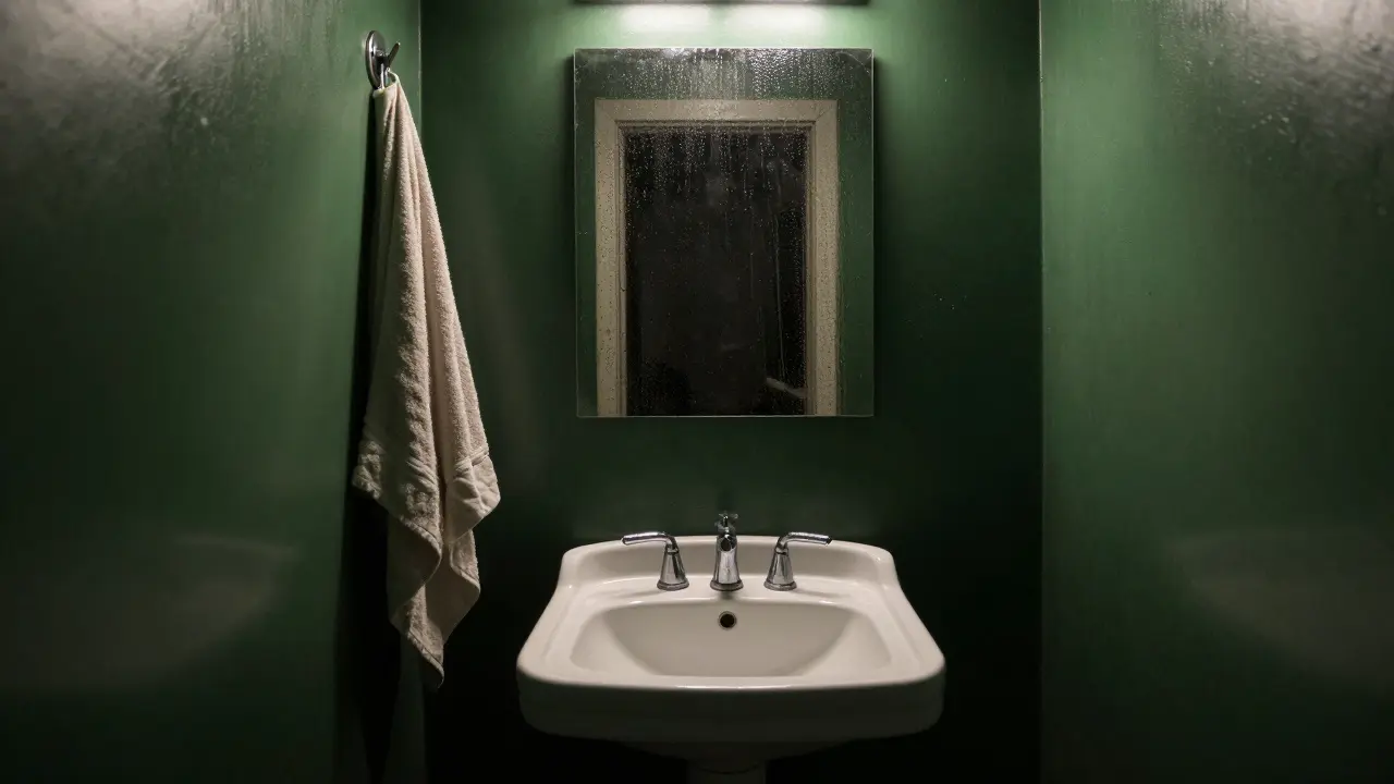
The One Color You Should Skip: Dark Green
Dark green-think forest, hunter, or olive tones-is the most common bathroom color mistake people make. It’s trendy on Instagram, popular in high-end hotels, and often sold as “earthy” or “organic.” But in a bathroom? It’s a disaster.
First, it absorbs light. In a small bathroom with a single overhead bulb, dark green walls make the space feel like a cave. No matter how clean you keep it, it looks dim and damp. Second, it clashes with the most common bathroom materials: white porcelain, chrome fixtures, and glass shower doors. The contrast isn’t elegant-it’s muddy. Third, and this is critical, dark green triggers subconscious associations with mold, mildew, and decay. It’s not just a color. It’s a visual cue your brain reads as “unhygienic.”
I’ve seen this in real homes. A client in Burlington repainted her powder room in a deep moss green because she loved the “nature vibe.” Six months later, she told me she avoided using the bathroom unless absolutely necessary. “It just looks dirty,” she said. “Even when it’s spotless.”
Other Colors That Backfire (And Why)
Dark green isn’t the only problem. Here are three more colors that look great in theory but fail in practice:
- Neon yellow-It’s cheerful in a kitchen, but in a bathroom, it feels like a warning sign. It’s harsh under fluorescent lights and makes skin tones look sallow. It’s the color of caution tape, not calm.
- Purple (especially plum or eggplant)-This one is tricky. Light lavender can work, but deep purple? It’s the color of bruises and old wine stains. In low light, it turns black. And in natural light, it looks like a cheap hotel from the 90s.
- Red-Yes, red is bold. But in a bathroom? It’s overwhelming. It raises your heart rate, makes you feel hot, and clashes with the cool, clean feeling you want after a shower. It’s the opposite of relaxing.
These colors don’t just look bad-they change how you experience the room. You don’t just see them. You feel them.
What Works Instead
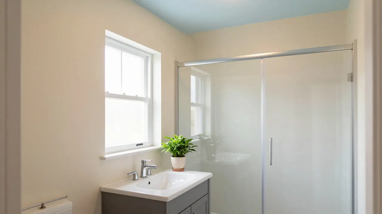
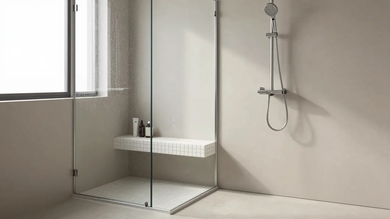
So what should you paint your bathroom? Stick to what works: soft whites, warm grays, muted taupes, and light blues. These colors reflect light, make small spaces feel bigger, and feel clean even when the room isn’t spotless.
White isn’t boring-it’s timeless. A soft white with a hint of cream (like Benjamin Moore’s “Chantilly Lace”) looks fresh and bright, even under dim bulbs. Warm grays (think Sherwin-Williams “Agreeable Gray”) add depth without heaviness. And light blue? It’s the color of clean water. It’s calming, refreshing, and has been used in hospitals and spas for decades for a reason.
And don’t forget the ceiling. Most people paint it white, but if you want to add a little depth without making the room feel smaller, go one shade lighter than the walls. It creates a subtle gradient that feels intentional, not lazy.
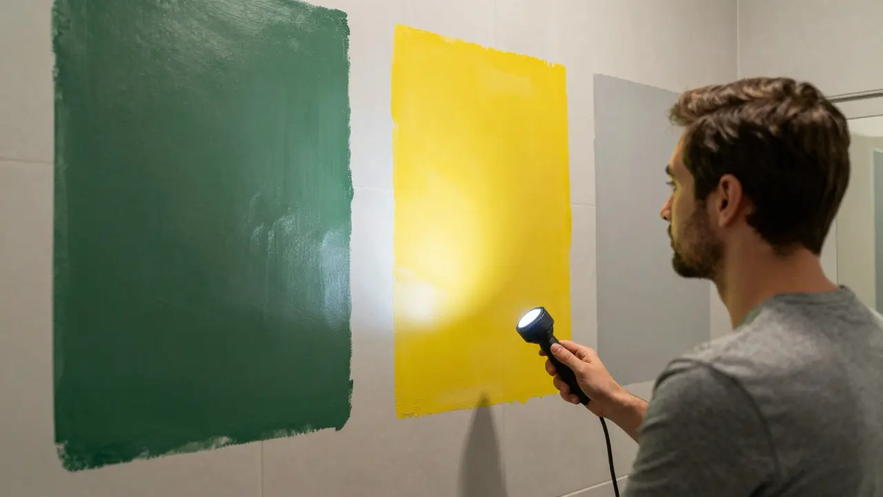
How to Test Colors Before You Paint
Don’t just buy a can and hope for the best. Test before you commit. Here’s how:
- Buy sample pots of three colors you’re considering-including one neutral and two you’re unsure about.
- Paint large swatches (at least 2x2 feet) on different walls. Don’t just paint a small square.
- Observe them at 8 a.m., 12 p.m., and 7 p.m. Natural light changes everything.
- Turn on every light in the bathroom. Does the color look flat? Harsh? Dull?
- Stand in the shower and look out. Does it feel like a place you want to spend time in?
If any color makes you think, “I’d rather just use the guest bathroom,” cross it off.
The Bigger Lesson: Color Is Emotional
This isn’t just about aesthetics. It’s about how space affects your daily life. A bathroom should be a place to reset. Not a place that drains you. The right color doesn’t shout. It whispers. It calms. It makes you feel clean, even when you’re just washing your hands.
People spend more time thinking about kitchen countertops than bathroom walls. But the bathroom is where you start and end your day. That’s why getting the color right matters more than you think. And avoiding the wrong one? That’s just as important.
Dark green isn’t the only color to avoid. But it’s the most common mistake. And once you’ve seen it in action, you’ll never forget it.
Is dark green always a bad choice for bathrooms?
Dark green isn’t always bad-but it’s rarely good in bathrooms. It works in large, sunlit spaces with high ceilings and plenty of natural materials like wood and stone. But in a typical home bathroom-small, enclosed, and often poorly lit-it absorbs light, makes the room feel smaller, and triggers subconscious associations with mold and dampness. Stick to lighter, brighter tones unless you’re working with a luxury spa-style design.
Can I use bold colors in a bathroom if I have good lighting?
Yes, but carefully. If your bathroom has large windows, skylights, or multiple light sources, you can get away with deeper tones like navy, charcoal, or even muted terracotta. But even then, avoid saturated, high-contrast colors like neon, red, or purple. Stick to colors that are dark but not intense-ones that feel rich, not overwhelming. Always test them at different times of day before committing.
What’s the best white for a bathroom?
Avoid pure white-it looks cold and clinical. Instead, choose a white with a warm undertone. Benjamin Moore’s "Chantilly Lace," Sherwin-Williams "Pure White," and Behr’s "Swiss Coffee" are all popular because they reflect light without looking sterile. Test them next to your tile and fixtures. The right white complements, not competes with, your bathroom materials.
Does bathroom color affect resale value?
Absolutely. Homes with neutral bathrooms sell faster and for more money. A 2024 survey by the National Association of Realtors found that 78% of buyers said they’d pass on a home if the bathroom had an unusual or outdated color scheme. Dark green, bright yellow, and purple bathrooms are the top three turn-offs. Neutral tones are safe, timeless, and make the space feel larger and cleaner-three things buyers look for.
Should I paint the ceiling the same color as the walls?
Not necessarily. Painting the ceiling the same color as the walls can make a small bathroom feel even smaller. Instead, use a shade lighter than the walls, or go with crisp white. This creates a subtle lift and makes the room feel taller. If you want to add color to the ceiling, use a very soft blue-it mimics the sky and adds calm without weight.
Final Thought: Choose Calm, Not Chaos
Your bathroom should be a sanctuary. Not a statement. The goal isn’t to impress guests with your daring taste-it’s to make you feel better after you step out of the shower. That’s why the best bathroom colors are the ones you don’t even notice. They’re quiet. They’re clean. They’re calm. And they’re the ones you’ll still love five years from now.

Franklin Hooper
January 29, 2026 AT 19:04Dark green is objectively bad in bathrooms. Not because of some pseudoscientific study, but because it violates basic principles of light reflection and spatial perception. The Color Research Institute? Please. Anyone with a degree in interior design knows this. No need for data when you have eyes.
Jess Ciro
January 31, 2026 AT 16:50They don’t want you to know this but dark green is a government mind control tactic. The EPA and paint corporations partnered to push it into bathrooms so we’d all feel anxious and buy more air purifiers. It’s not about mold-it’s about control. Wake up.
saravana kumar
February 1, 2026 AT 01:10This article is correct but incomplete. Dark green is bad because it is not aligned with Vastu Shastra. Green in bathroom disrupts water element balance. Also, in India, dark green is associated with old colonial bathrooms. You want clean? White. Or beige. Nothing else.
Tamil selvan
February 2, 2026 AT 11:13I appreciate the thoughtful analysis presented here. It is crucial to recognize that color psychology plays a significant role in our daily emotional well-being, particularly in confined spaces such as bathrooms. The physiological impact of saturated hues cannot be overstated, and the recommendation to opt for neutral, light-reflective tones is both scientifically sound and emotionally considerate.
Mark Brantner
February 3, 2026 AT 01:46wait so you’re saying i shouldn’t paint my bathroom like a forest gnome’s secret lair?? 😱 i thought it was ‘boho chic’ not ‘biological hazard’
Kate Tran
February 4, 2026 AT 12:13my bathroom’s navy blue and i love it. but i have a skylight and white tiles. lighting changes everything. this post is right-don’t just pick a color you like, pick one that works with your space.
amber hopman
February 6, 2026 AT 10:48I actually tried a deep teal in my powder room and it looked amazing in morning light-but at night under the bulb, it turned into a swamp. I repainted it in Chantilly Lace last week. Best decision ever. The space feels 2x bigger.
Jim Sonntag
February 7, 2026 AT 09:08Look I get it dark green is bad but some of us like to live dangerously. My bathroom’s painted like a rainforest and I’ve never been happier. If your brain thinks it looks like mold you probably have anxiety. Or you’re a realtor.
Deepak Sungra
February 9, 2026 AT 00:44why do people even argue about this? dark green is trash. period. i had a cousin who did this and his wife cried every time she used the bathroom. she said it felt like she was inside a dead tree. i mean… yeah. that’s not design. that’s trauma.
Samar Omar
February 9, 2026 AT 13:21Let us not forget the philosophical implications of chromatic dominance in micro-environments. The bathroom, as a liminal space between self and society, demands a palette that does not assault the psyche. Dark green, in its chromatic density, becomes an ontological obstruction-a visual metaphor for repressed emotion. One cannot cleanse oneself in a chamber that whispers of decay. The color does not merely reflect light-it reflects the soul’s disquiet. Hence, neutrality is not aesthetic preference. It is existential hygiene.
Christina Morgan
February 11, 2026 AT 12:56Just painted my bathroom Sherwin-Williams ‘Sea Salt’ and I can’t believe how much better it feels. No more dread before showers. Also, ceiling is ‘Alabaster’ one shade lighter. It’s subtle but makes the room feel taller. So simple, so effective.
Kathy Yip
February 12, 2026 AT 18:16i think the real issue is we’ve been trained to think ‘clean’ means white. what if clean means calm? what if clean means feeling safe? maybe the color isn’t the problem… maybe our cultural obsession with sterility is.
Bridget Kutsche
February 12, 2026 AT 22:08Testing colors at different times of day is non-negotiable. I learned this the hard way-bought ‘Sage Green’ because it looked cozy in the store. At 7 PM, it looked like a wet sock. Now I use the same method with all my paint samples. Save yourself the regret.
Jack Gifford
February 14, 2026 AT 06:11Also avoid anything that says ‘bathroom’ on the paint can. That’s not a thing. You’re not painting a toilet. You’re painting a space where you think about your life. Choose accordingly.
Sarah Meadows
February 15, 2026 AT 06:44Dark green is a liberal design trope. It’s forced by coastal elites who think ‘earthy’ means ‘depressed.’ Real Americans use white. Or cream. Or beige. The kind of colors that don’t make you feel like you’re in a Scandinavian funeral parlor.