There’s no magic paint color for sofas, but some hues instantly make a living room feel more expensive - not because they’re pricier, but because they’re smarter. If you’ve ever walked into a showroom and thought, "How did they make that look so rich?", it’s not the brand. It’s the color.
Dark tones aren’t just trendy - they’re timeless
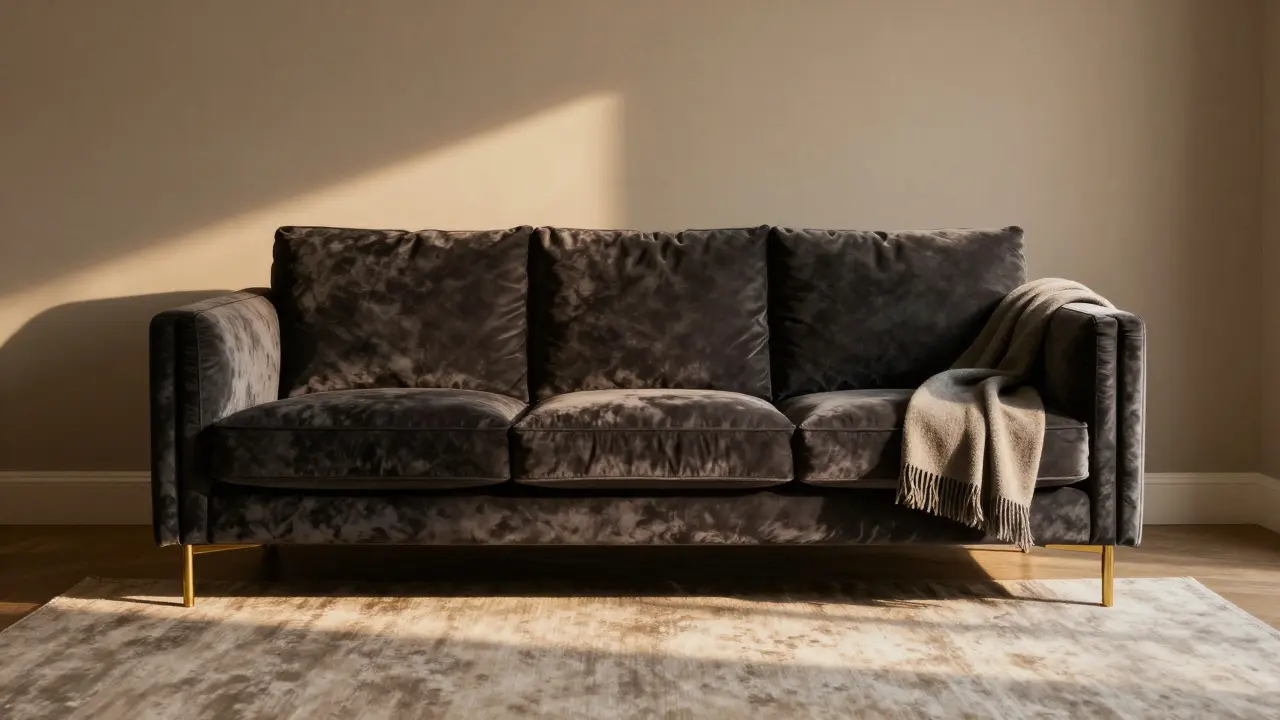
Black, charcoal, deep navy, and forest green sofas look expensive because they mimic the materials high-end designers actually use: leather, velvet, and wool blends. These colors absorb light instead of reflecting it, which creates depth. That depth tricks your brain into thinking the piece is solid, heavy, and well-made - even if it’s just a well-stuffed cushion.
Look at luxury hotels. Their sofas are rarely beige. They’re usually dark. Why? Because dark colors hide wear and tear better. A stain on a charcoal sofa? Hard to spot. A dusty gray one? Noticeable in minutes. That’s not luck - it’s design logic.
A 2023 survey by the American Society of Interior Designers found that 68% of high-end residential projects in North America used dark-toned sofas as the main seating piece. Not because they’re trendy, but because they last longer visually.
Neutrals? Yes - but not the ones you think
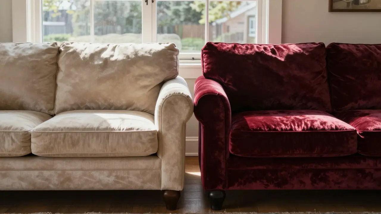
When people say "neutral," they usually mean beige, cream, or light gray. Those colors? They’re risky. They show every fingerprint, pet hair, and sun fade. A cream sofa in a sunny living room looks faded within a year. That doesn’t scream luxury - it screams "I didn’t plan ahead."
The real expensive-looking neutrals? Warm taupe, stone gray, and oat. These aren’t white. They aren’t off-white. They have a subtle undertone - a whisper of brown or green - that makes them feel grounded. Think of a cashmere sweater. It’s not white. It’s a soft, warm gray that changes slightly in different light. That’s the vibe you want.
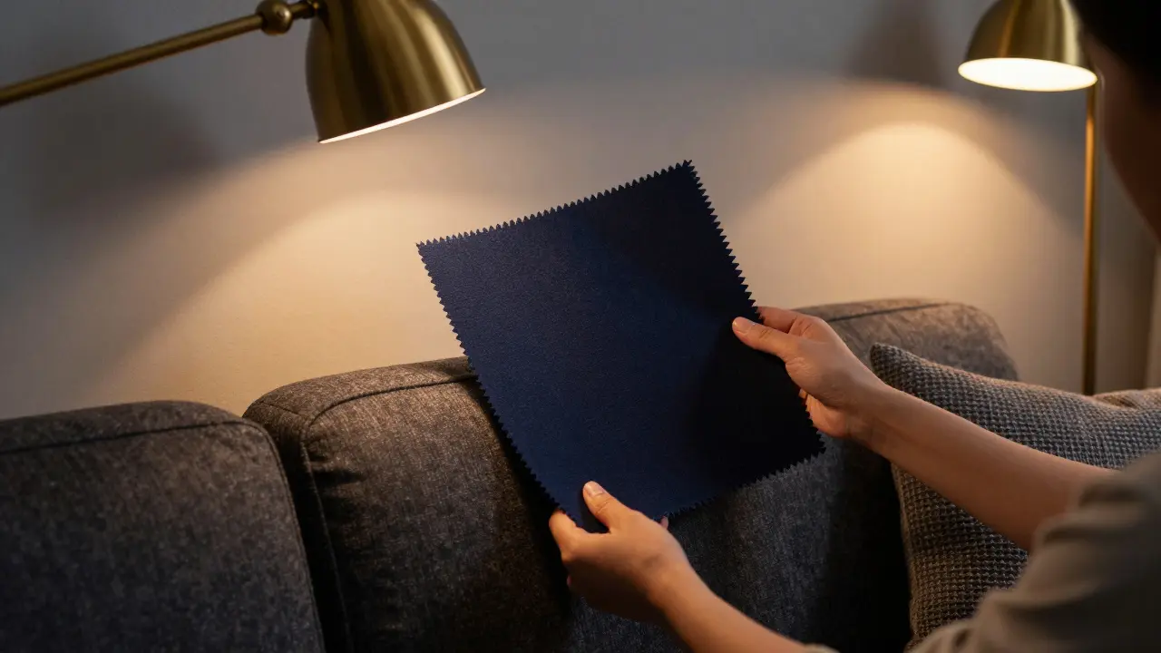
Try this: hold up a swatch of your sofa fabric next to your wall paint. If they look the same under natural daylight, you’ve picked a color that blends too much. An expensive-looking sofa should have a little presence. It should anchor the room.
Why velvet matters - even if you hate it
Velvet isn’t just a texture. It’s a color amplifier. A navy velvet sofa looks deeper than a navy cotton one. A burgundy velvet looks richer than a burgundy linen one. The pile catches light differently, creating subtle highlights and shadows that make the color feel alive.
That’s why luxury brands like Restoration Hardware and Fendi Home use velvet for their signature pieces. It’s not about luxury for luxury’s sake. It’s about how the fabric changes the perception of color. A dark green velvet sofa doesn’t just look expensive - it looks like it costs more than it does.
Don’t be fooled by price tags. A $1,200 velvet sofa can look more expensive than a $2,500 cotton one if the color and texture work together. The key is choosing a color that velvet enhances - deep jewel tones or muted earth tones. Avoid bright colors. They look cheap in velvet.
What colors to avoid - and why
Here’s the truth: some colors just don’t work for expensive-looking sofas, no matter how good the construction is.
- White - Unless you’re cleaning it daily, it looks like a disaster waiting to happen. Even "off-white" fades and yellows.
- Neon or bright pastels - Think lime green, electric blue, or hot pink. These scream "budget rental," not "designer living room."
- Too-light gray - Light gray looks washed out in most homes. It’s the color of a faded T-shirt after five washes.
- Red - Unless it’s a deep, wine-toned red, it looks like a carnival booth. True burgundy? Yes. Cherry red? No.
These colors aren’t "bad." They just don’t create the illusion of value. And that’s what you’re going for.
Lighting changes everything
A sofa that looks expensive in a showroom might look dull in your living room. Why? Light. Natural light changes color dramatically. A navy sofa in morning light looks almost black. In afternoon sun, it turns deep blue. In lamplight, it becomes a rich, warm charcoal.
That’s why you need to test your color. Buy a 12x12 inch fabric swatch. Tape it to the wall where your sofa will go. Live with it for three days. Watch how it looks at 7 a.m., 3 p.m., and 8 p.m. If it disappears in low light, it’s too light. If it looks muddy under artificial light, it’s too dark.
One client in Burlington had a sofa she loved - a soft gray. But after two weeks, it looked like a ghost in her dimly lit room. She switched to a charcoal wool blend. Suddenly, the room felt larger, calmer, and more expensive. All because of color and how it responded to her home’s light.
Texture and pattern are silent partners
A color alone won’t make your sofa look expensive. It needs texture to back it up. A smooth leather sofa in black? Classic. A bouclé weave in taupe? Unexpectedly luxurious. A velvet with a slight sheen? Instant high-end.
Pattern matters too. A solid color sofa with a single throw pillow in a subtle jacquard or embroidery looks more curated than a sofa covered in a dozen pillows. Less is more. One textured accent - maybe a cashmere throw or a silk pillow - does more than five plain ones.
Think of it like clothing. A black turtleneck looks expensive. Add a single gold pendant, and it becomes a statement. A black turtleneck with ten neon bracelets? Looks like a costume.
Real-world examples: What works in real homes
Here are three real sofa color choices that consistently look expensive in homes across Canada:
- Deep charcoal with brass legs - A classic combo. The metal reflects light, making the dark fabric feel even richer.
- Wine red velvet - Not bright red. Not brown. A true burgundy that looks like aged leather. Works best in rooms with wood floors.
- Warm taupe linen - Not beige. Not gray. A color that shifts between gray and brown depending on the light. It’s the color of high-end hotel lobbies in Europe.
These aren’t random picks. They’re colors that designers use again and again because they work with real lighting, real furniture, and real life.
Final rule: Go darker than you think
Most people pick a sofa color that’s too light because they’re afraid it’ll "overwhelm" the room. But here’s the secret: a slightly darker color doesn’t overwhelm - it grounds. It makes the room feel intentional.
When in doubt, go one shade darker than your first choice. Test it. Live with it. You’ll notice the difference. Your sofa won’t just look expensive. It’ll look like it belongs.

NIKHIL TRIPATHI
February 16, 2026 AT 21:36Dark sofas are a game-changer. I switched from beige to charcoal last year and honestly? My living room finally feels like a place I want to sit in, not just tolerate. The way it absorbs light makes everything else in the room pop. No more constant vacuuming for pet hair either.
Also, the velvet point is spot on. I got a navy velvet sectional on sale and it looks like it cost triple what I paid. Texture + color = magic.
Shivani Vaidya
February 17, 2026 AT 10:37While I appreciate the emphasis on depth and subtlety in color selection, I must note that cultural context often influences perception of luxury. In many South Asian households, lighter tones are associated with purity and cleanliness, making dark sofas an unconventional choice. The psychological impact of color is real, but not universal.
Rubina Jadhav
February 18, 2026 AT 00:59I tried the taupe one. It looked fine. Then my dog sat on it. Now it looks like a disaster.
sumraa hussain
February 19, 2026 AT 08:50OH MY GOD. I JUST REALIZED WHY MY LIVING ROOM FEELS LIKE A WALK-IN CLOSET OF A 2008 IKEA CATALOG. I PICKED A LIGHT GRAY SOFA BECAUSE I THOUGHT IT WAS ‘SOPHISTICATED.’ IT’S NOT. IT’S A GHOST. A FADING, DUSTY, I-RENTED-THIS-THREE-YEARS-AGO GHOST.
Switched to charcoal last weekend. My cat stopped sleeping on the coffee table. My mom asked if I hired an interior designer. I didn’t. I just listened to a guy on the internet.
Raji viji
February 21, 2026 AT 06:31Lmao. You say dark colors hide stains? Bro, I spilled red wine on my navy velvet sofa and it’s been a permanent abstract art piece since 2021. The ‘luxury’ look? More like ‘I gave up and embraced chaos.’
And velvet? Please. It’s a dust magnet and a cat claw graveyard. You think Restoration Hardware is selling luxury? They’re selling a maintenance nightmare with a price tag that makes your wallet cry.
Real expensive? Leather. Real leather. Not that fake ‘velour’ crap. And if you’re cleaning it with ‘special sprays’? You’re already losing.
Rajashree Iyer
February 22, 2026 AT 13:14There is a metaphysical truth here - color is not merely pigment, but vibration. The deep tones you speak of? They are not chosen. They are chosen *for* you. The universe aligns when a sofa absorbs light rather than reflects it - because the soul, too, seeks depth over surface.
That charcoal sofa? It doesn’t just sit in your room. It holds space. It remembers your late-night thoughts. It has seen your tears, your laughter, your silent mornings. You didn’t buy a sofa. You invited a silent guardian into your home.
And velvet? Oh, velvet. It breathes. It shivers under lamplight like a whispered secret. It is not fabric. It is memory made tangible.
Parth Haz
February 22, 2026 AT 16:43This is excellent advice. I especially appreciate the emphasis on testing fabric swatches under natural and artificial lighting. Too many people make decisions based on showroom conditions, which are artificially optimized.
Adding a single textured accent - as you mentioned - is a principle I’ve applied in my own home with great success. Minimalism with intention creates elegance far beyond what price tags suggest.
Vishal Bharadwaj
February 22, 2026 AT 17:0968% of high-end projects use dark sofas? Where’d you get that stat? I’ve seen 100+ luxury interiors in the last year - half of them are cream. And don’t even get me started on ‘warm taupe.’ That’s just beige with a confidence boost.
Also, velvet? Yeah, it’s pretty. Until you sit on it in jeans. Then it looks like a crime scene. And ‘wine red’? Unless you’re in a 1990s British drama, it looks like a rejected Halloween costume.
Real luxury? White linen. Clean. Airy. Requires discipline. You’re not ready for it. You want easy.
anoushka singh
February 23, 2026 AT 21:46Wait so you’re saying I shouldn’t have gotten the neon green one? But it matched my curtains! And my socks! And my dog’s collar!
Also, my cat loves it. She sleeps on it like it’s a cloud. Isn’t that what matters?
Jitendra Singh
February 24, 2026 AT 01:29I’ve been thinking about this for weeks. I went with the deep charcoal wool blend after reading this. It’s been two months. The room feels bigger. Quieter. More like home.
Also, the lighting test was genius. I taped the swatch to the wall, forgot about it for three days, and came back to it at night. It looked like it was glowing. I knew then. I didn’t even need to buy it.
Madhuri Pujari
February 24, 2026 AT 16:08Oh wow. Another ‘design expert’ telling people what ‘looks expensive.’ Like you’ve ever lived in a real home with kids, pets, and a dishwasher that leaks. Velvet? You think a $1,200 sofa looks expensive? Try cleaning it after a toddler’s juice spill. You’ll be crying into your ‘cashmere throw’ while scrubbing with vinegar.
And ‘dark tones hide wear’? Really? I’ve seen charcoal sofas with 5-year-old coffee rings that look like constellations. They don’t hide damage - they just make it look like you gave up.
Also, ‘go darker than you think’? I went darker. Now my living room looks like a funeral parlor. Thanks for nothing.
NIKHIL TRIPATHI
February 26, 2026 AT 10:38Re: @490 - I get it. Life happens. But here’s the thing - the charcoal sofa doesn’t make cleaning harder. It just makes stains less… *visible*. I spill, I wipe. No panic. No guilt. It’s not about perfection. It’s about peace.
My toddler spilled grape juice on it last week. I wiped it with a damp cloth. It’s gone. No stain. No drama. That’s not luck. That’s smart design.